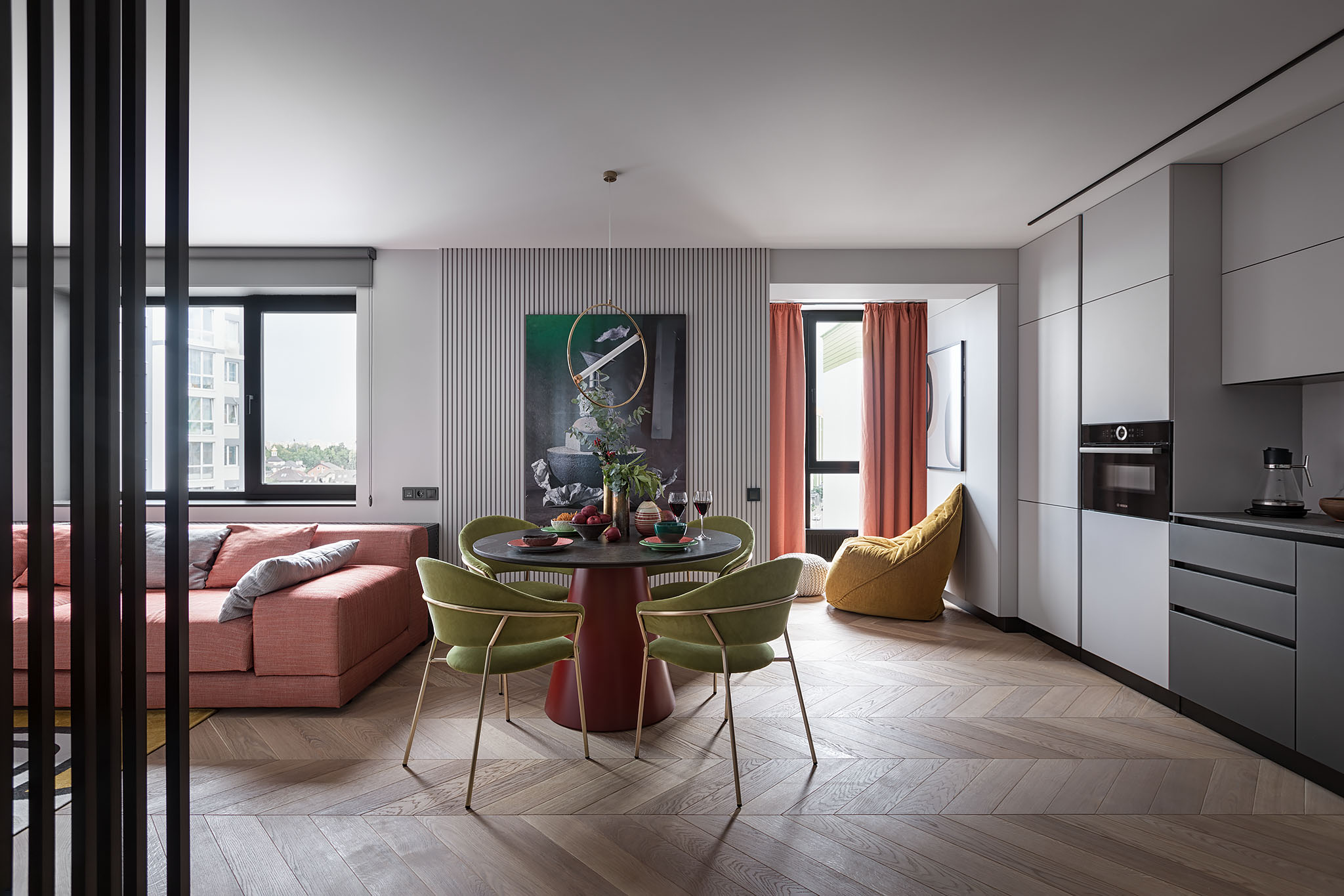
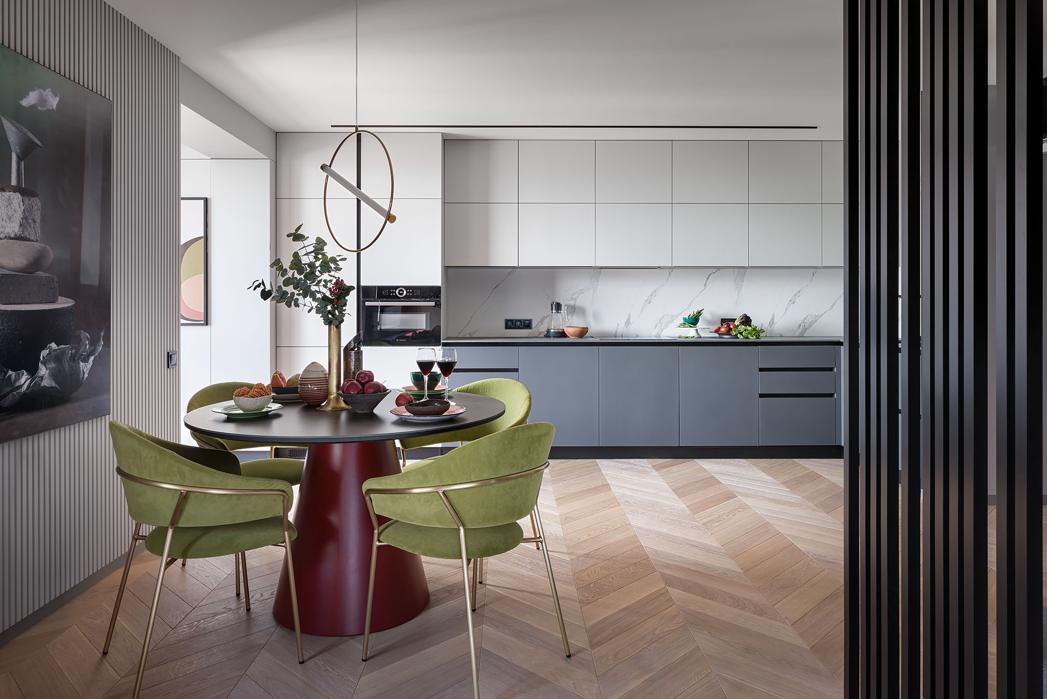
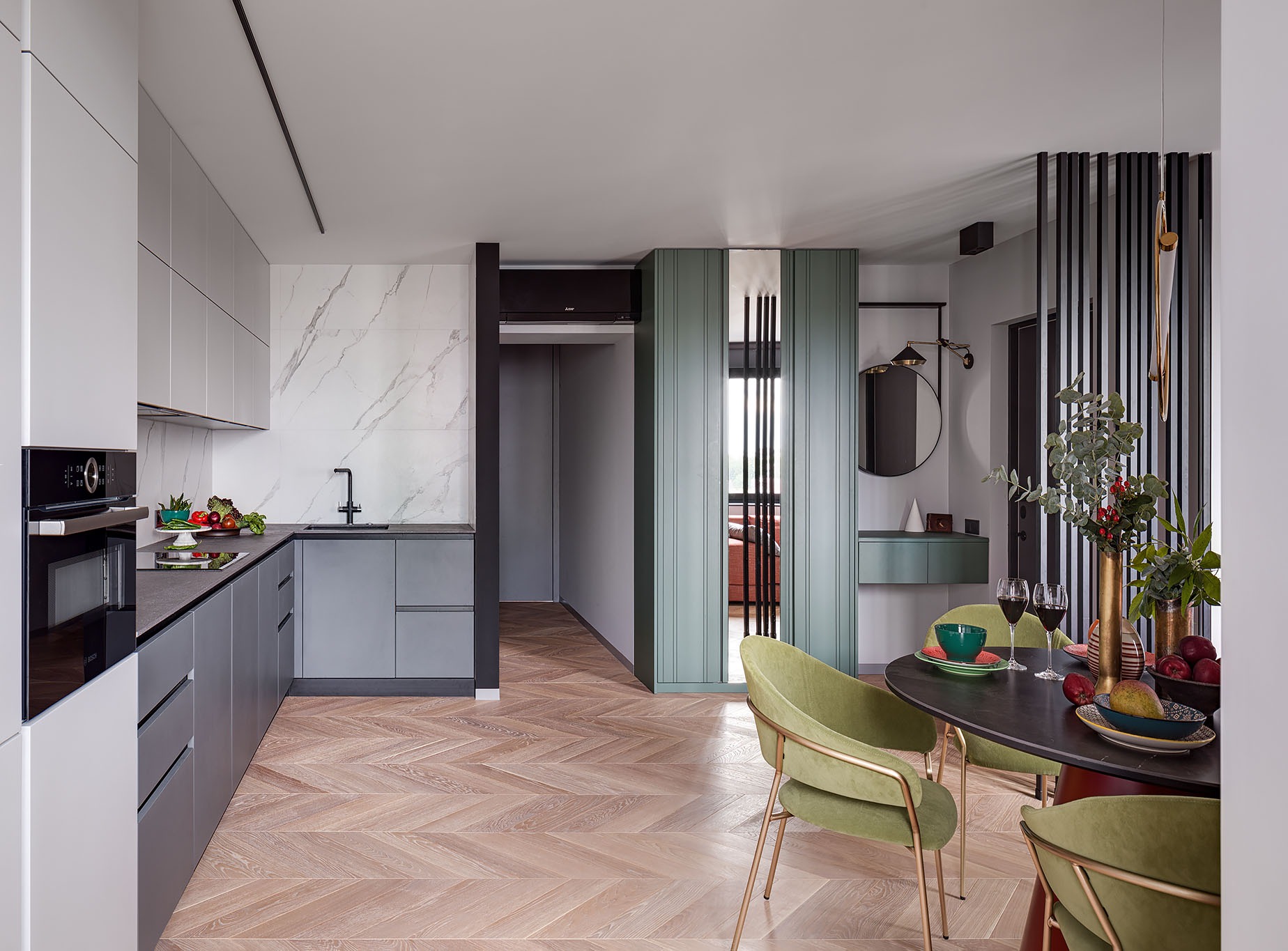
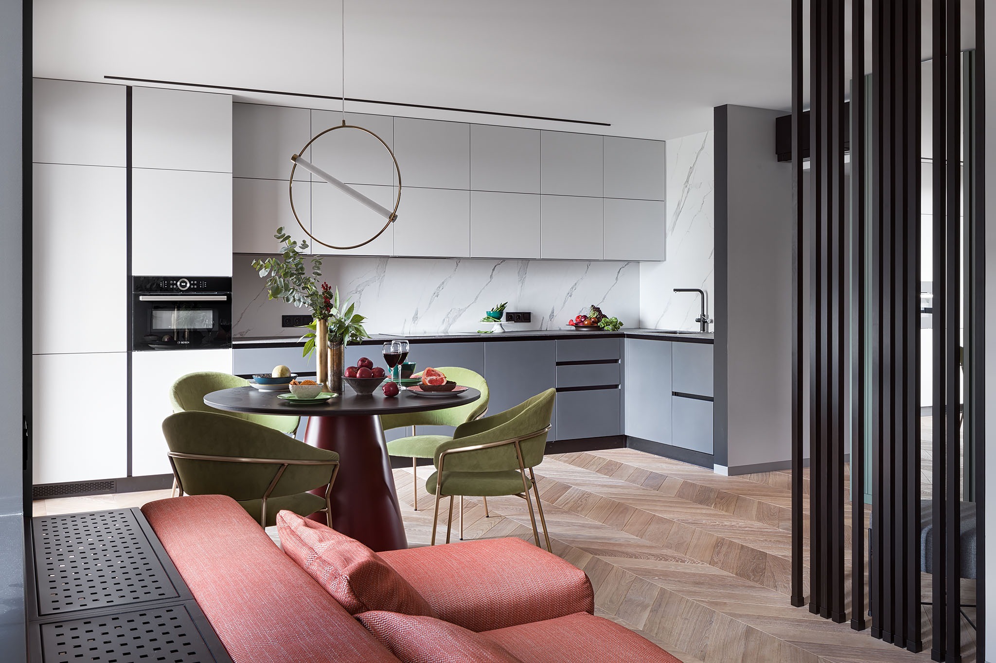
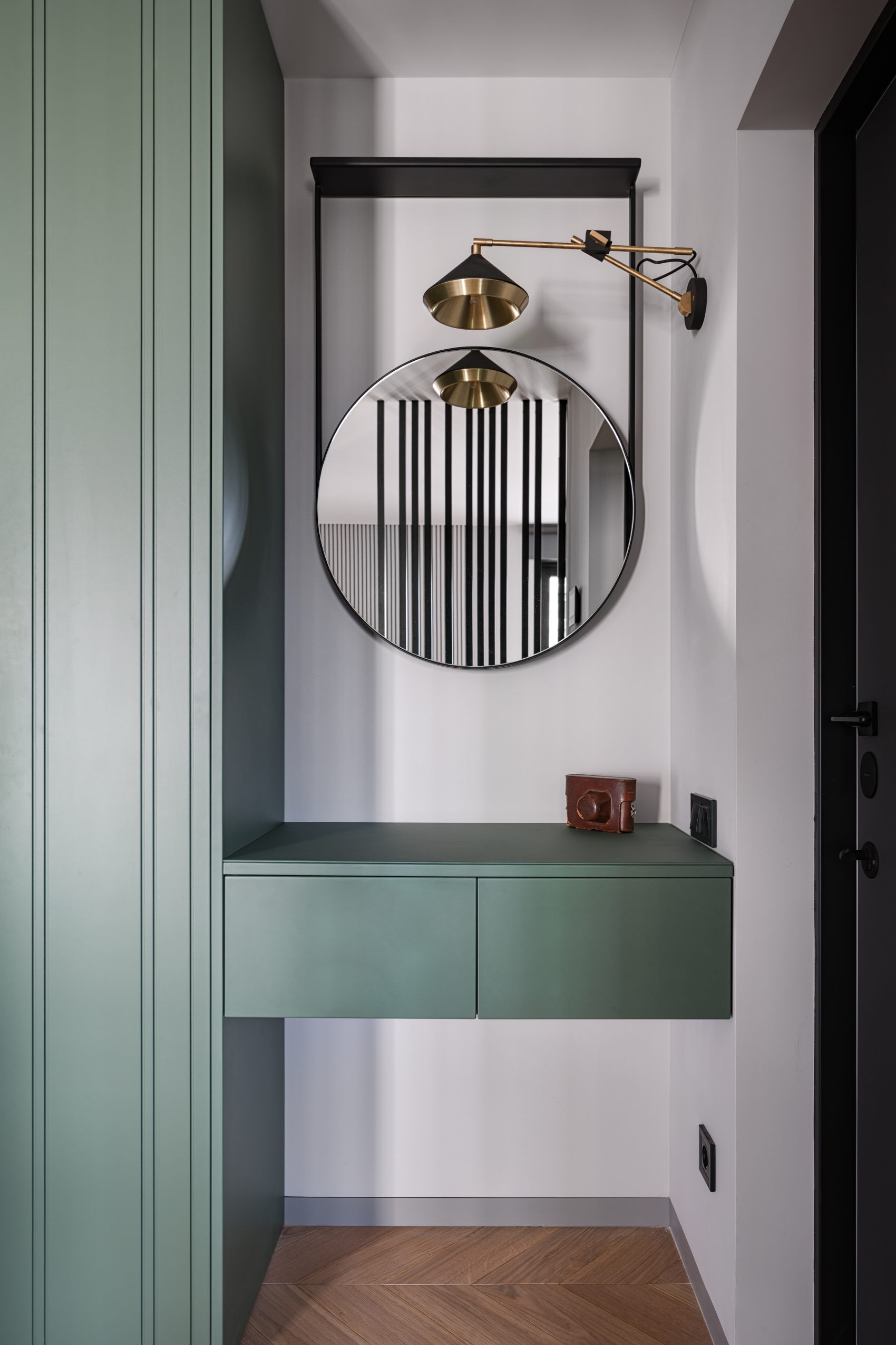
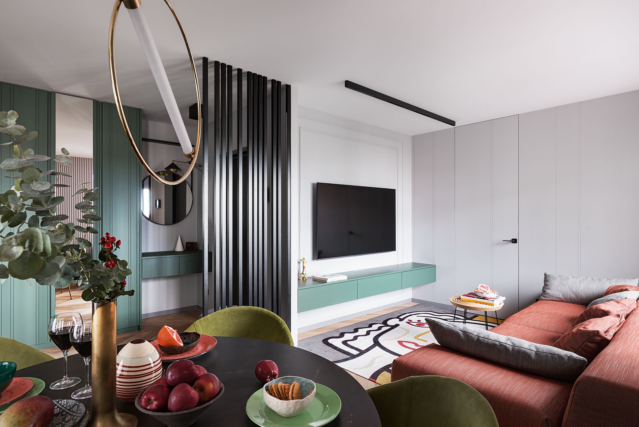
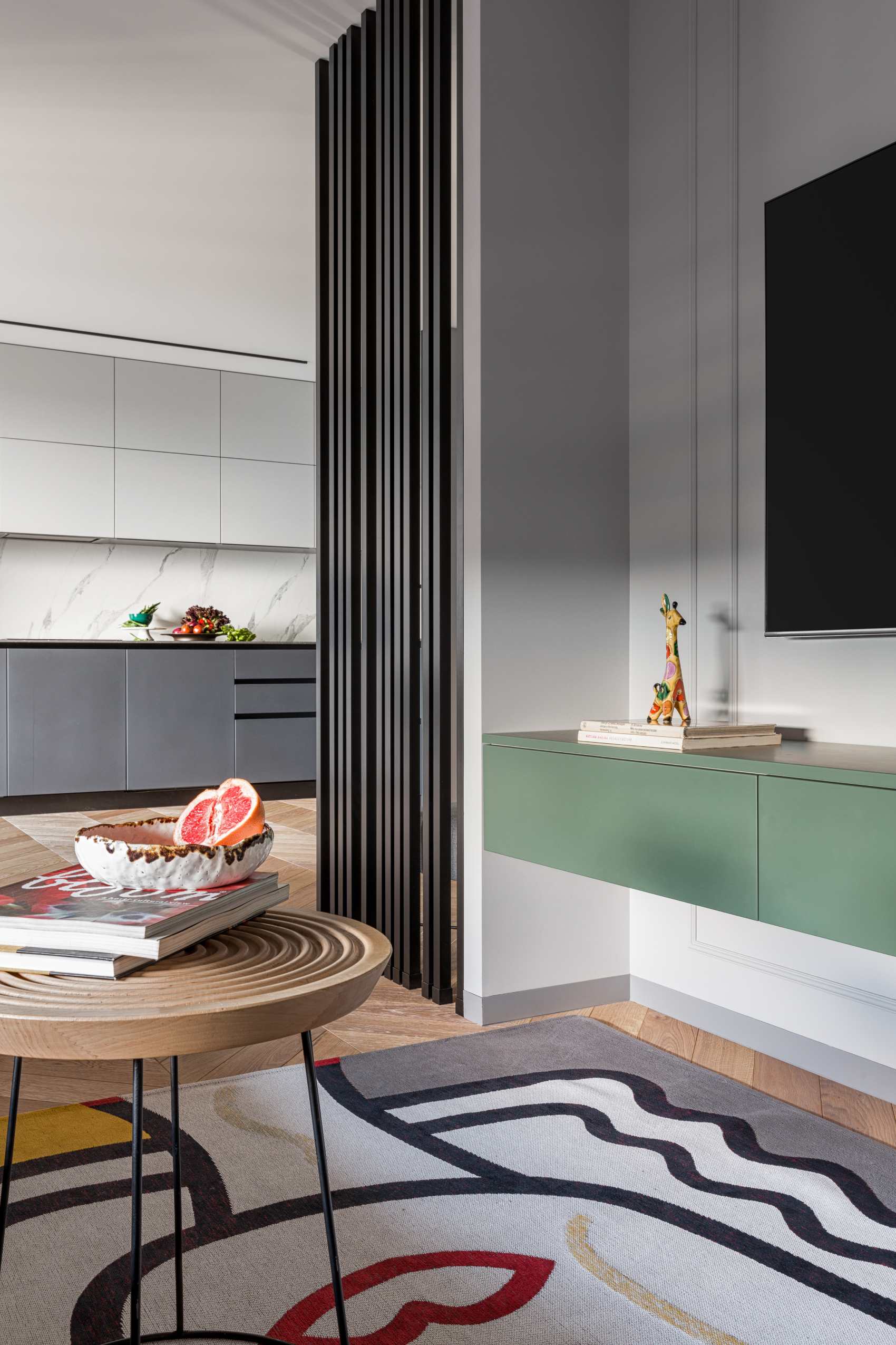
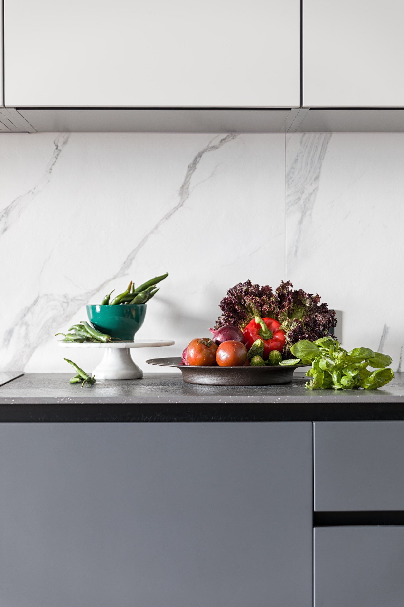
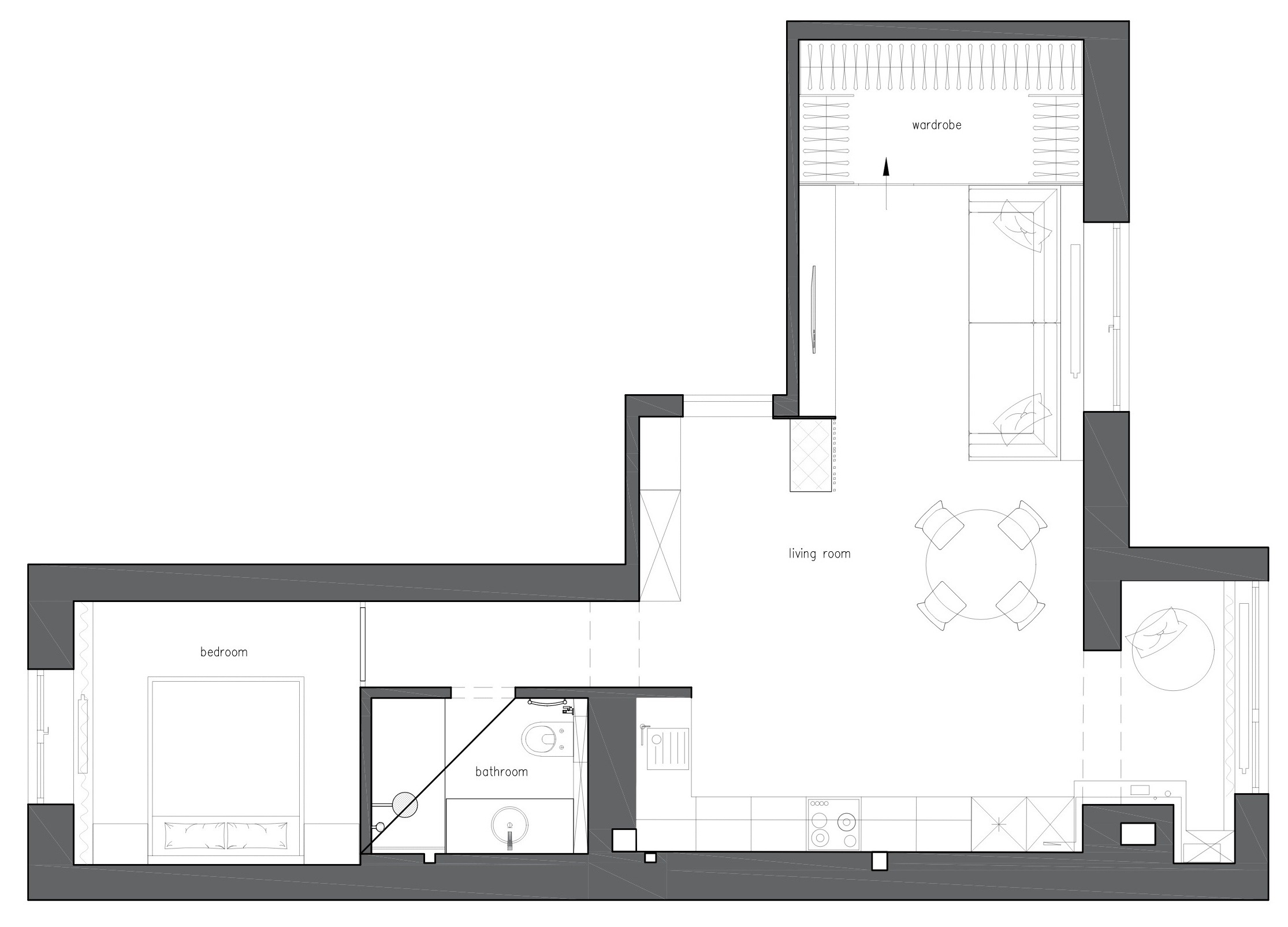
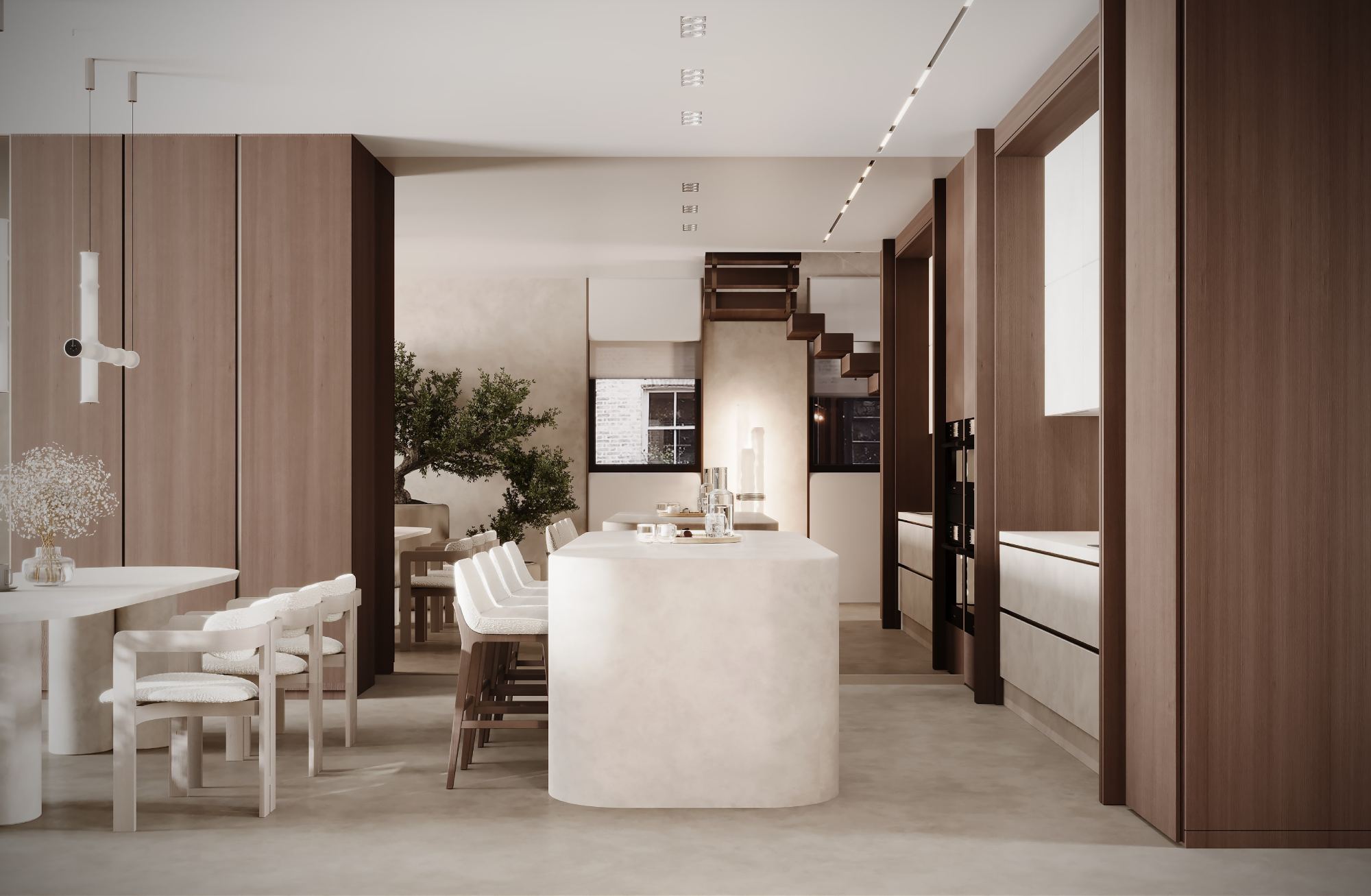
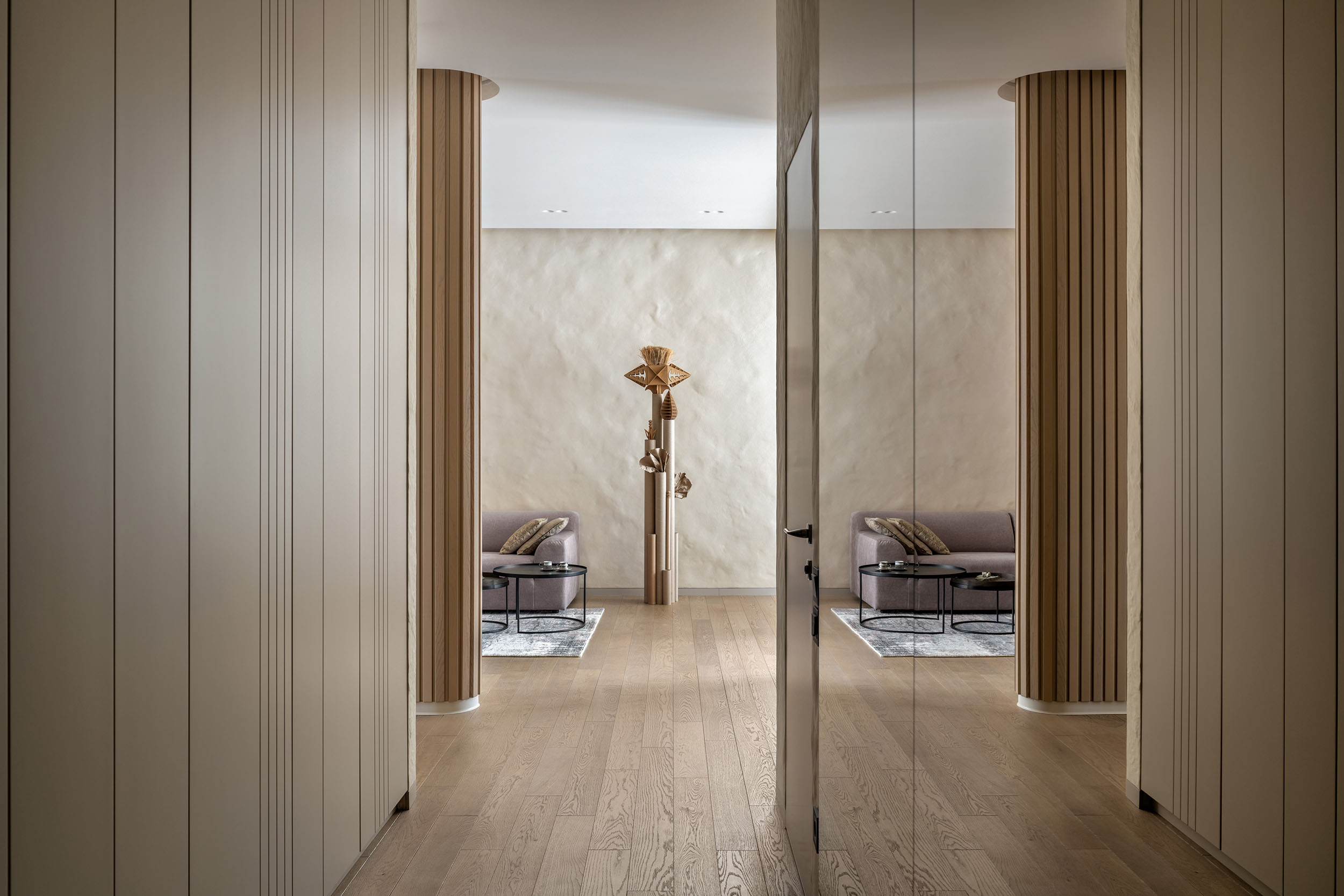
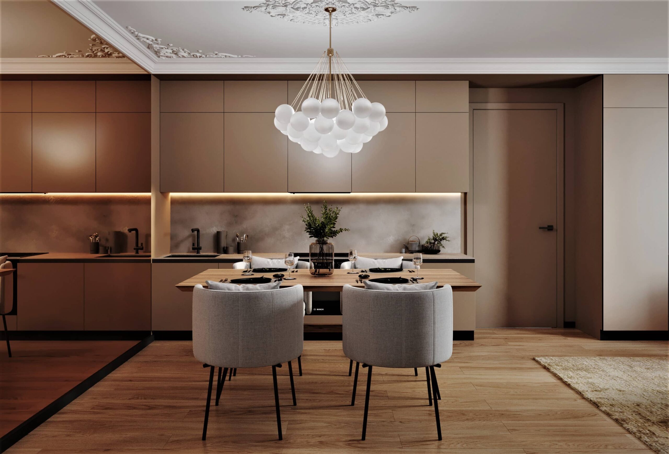
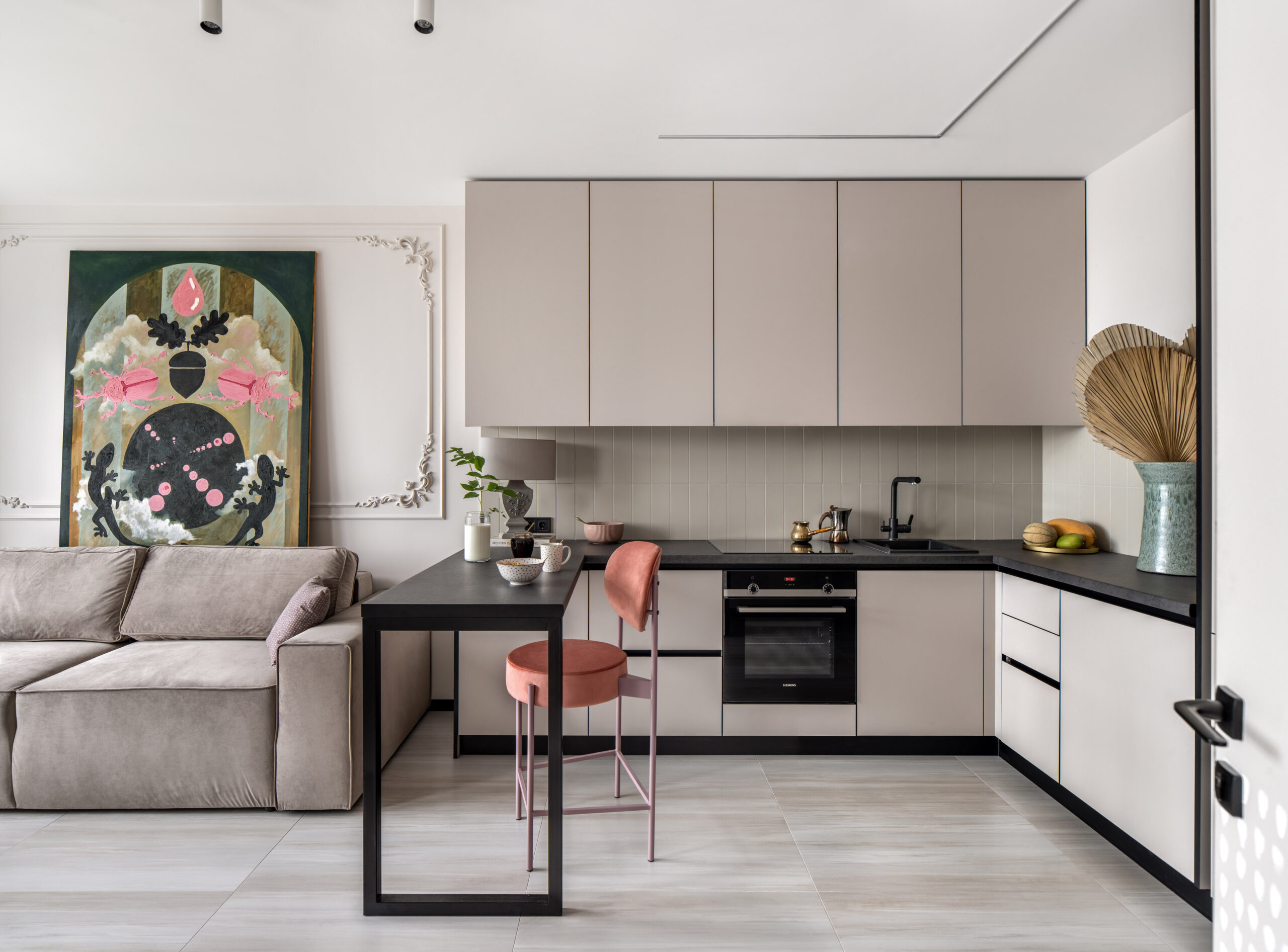
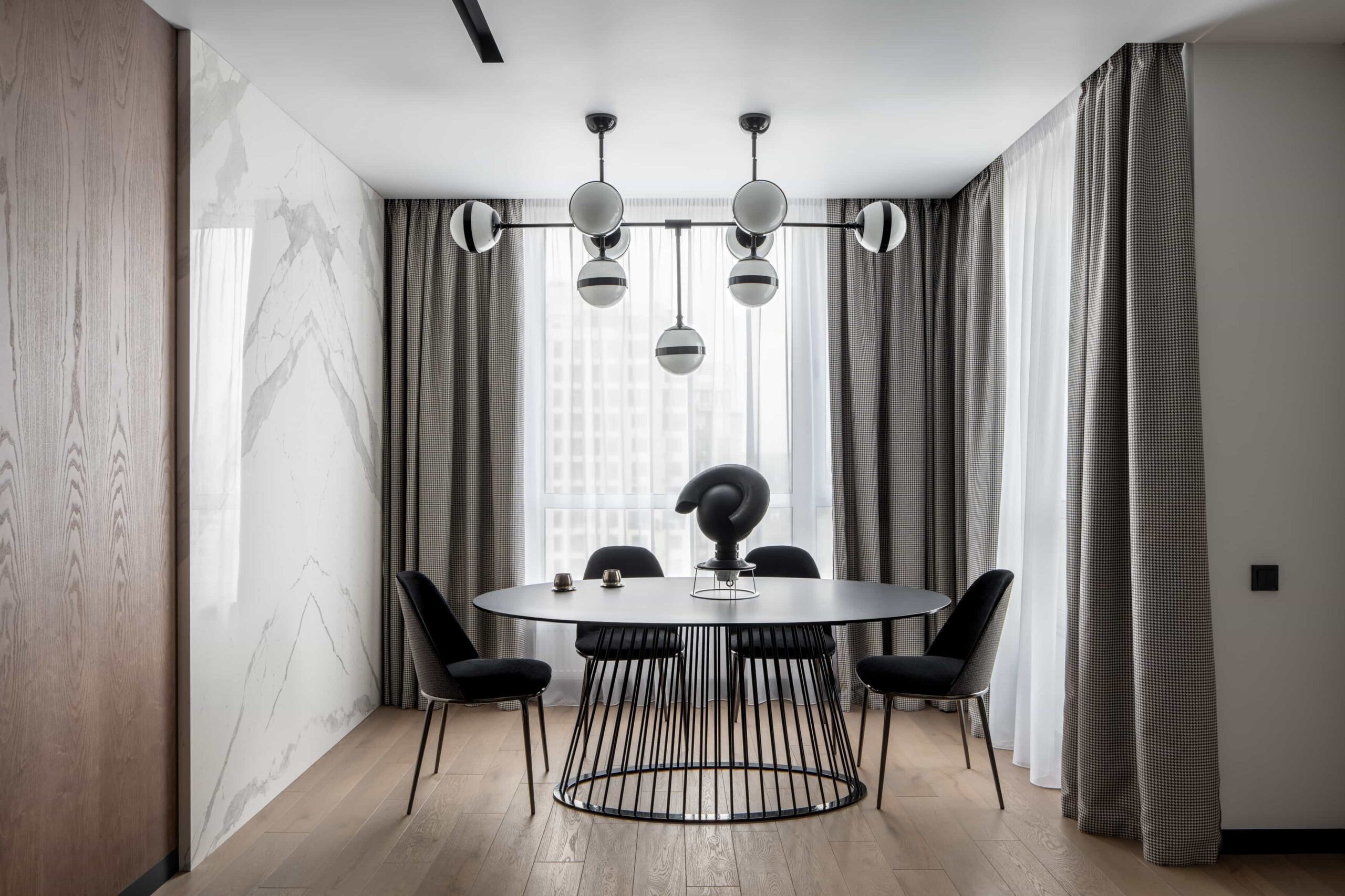
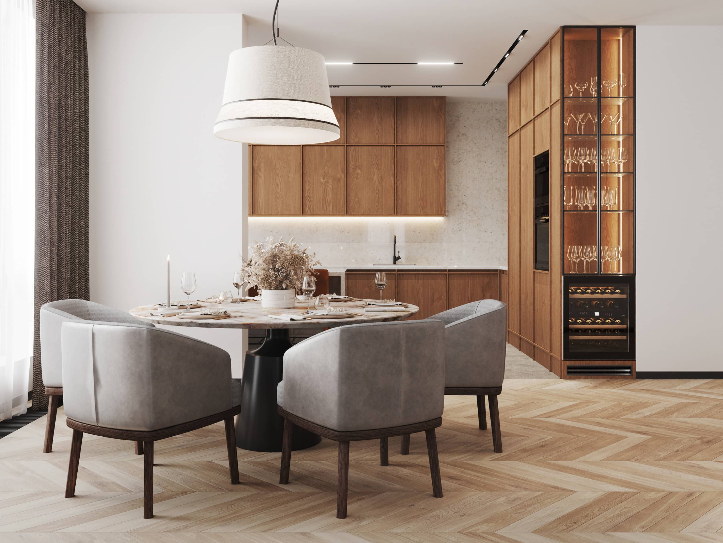
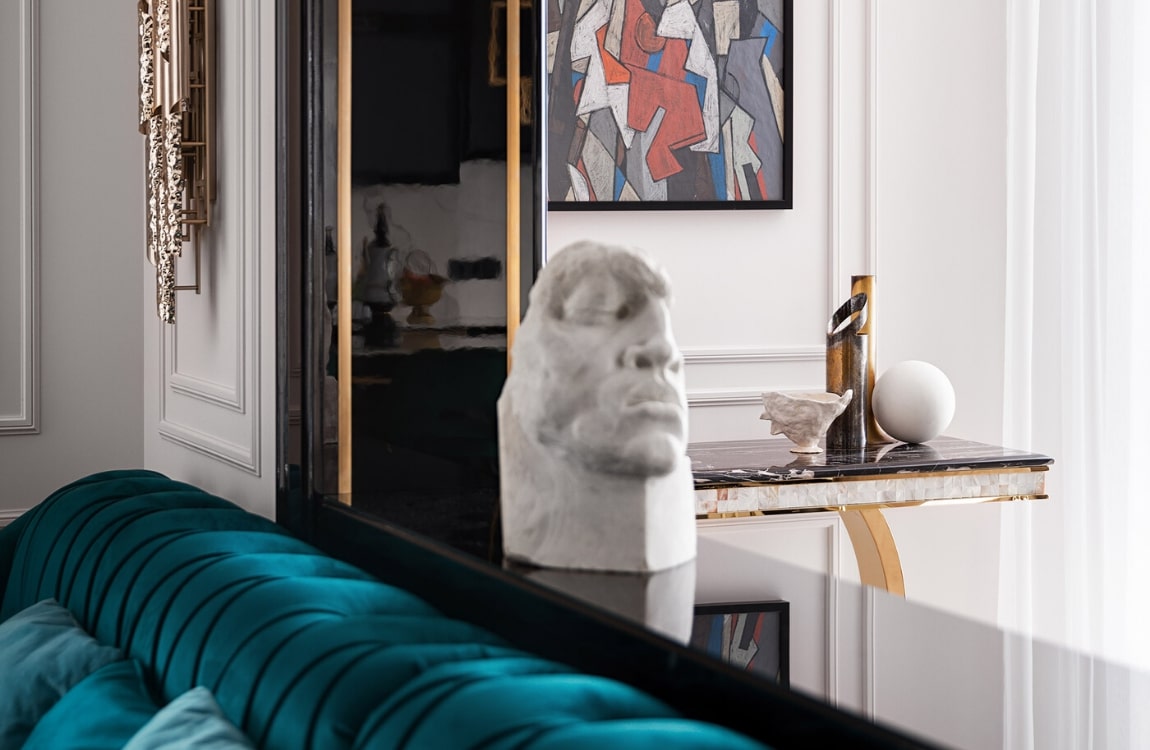
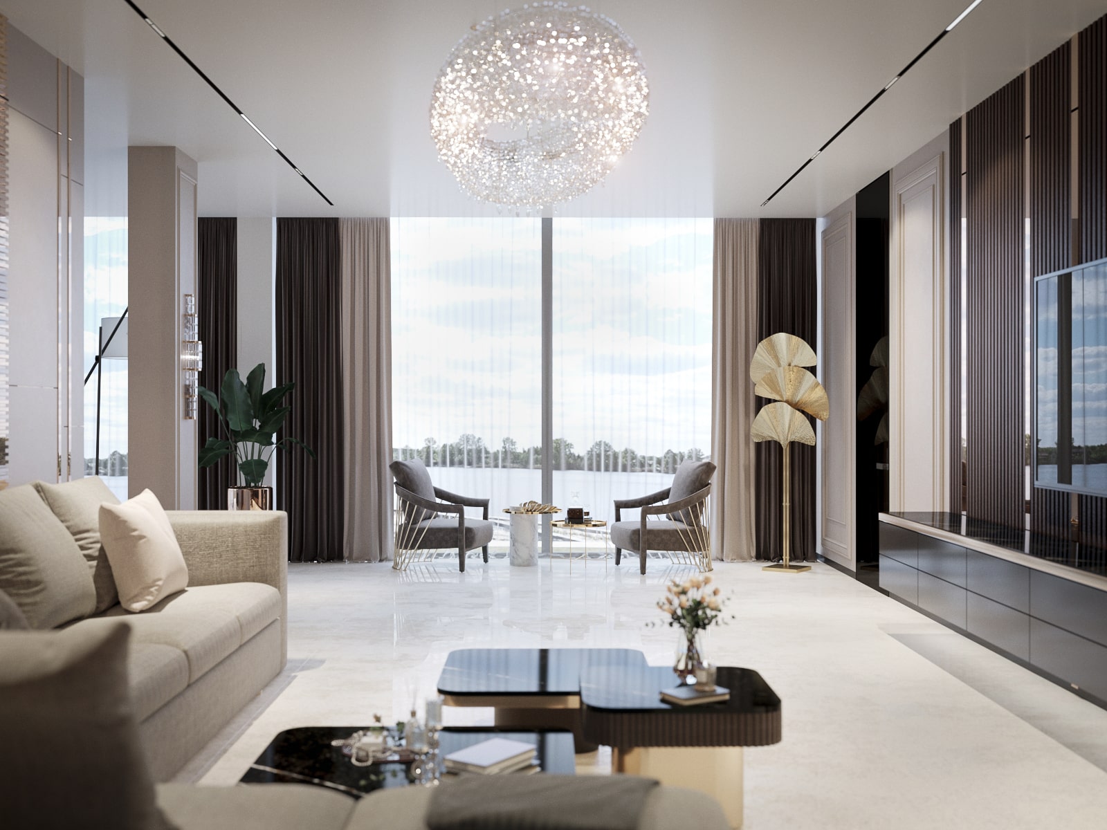
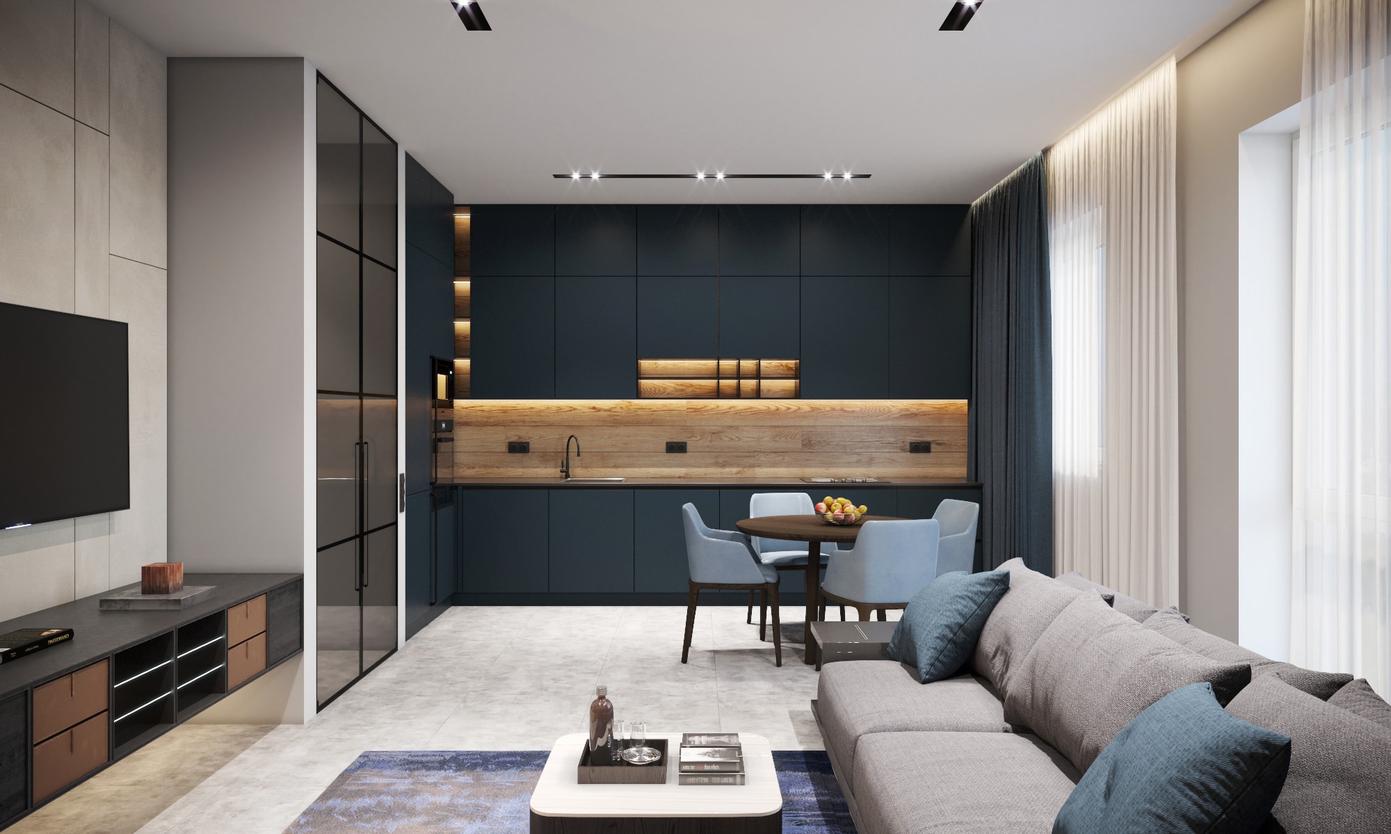
We began by knocking down all the interior walls, as the original rooms were too tiny to make decent rooms one could live in. Behind the minimalist facades of the kitchen furniture we hid a washing machine, utility meters, a water heater and a cabinet for various household things.
The client entrusted us with the whole process of renovation, from A to Z, including all the purchases (turnkey interior design). We selected high quality durable materials that had passed the test of time.
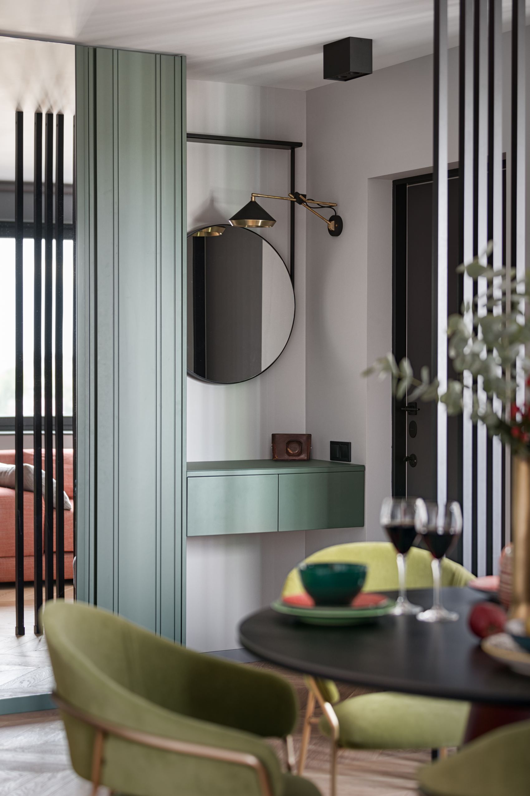
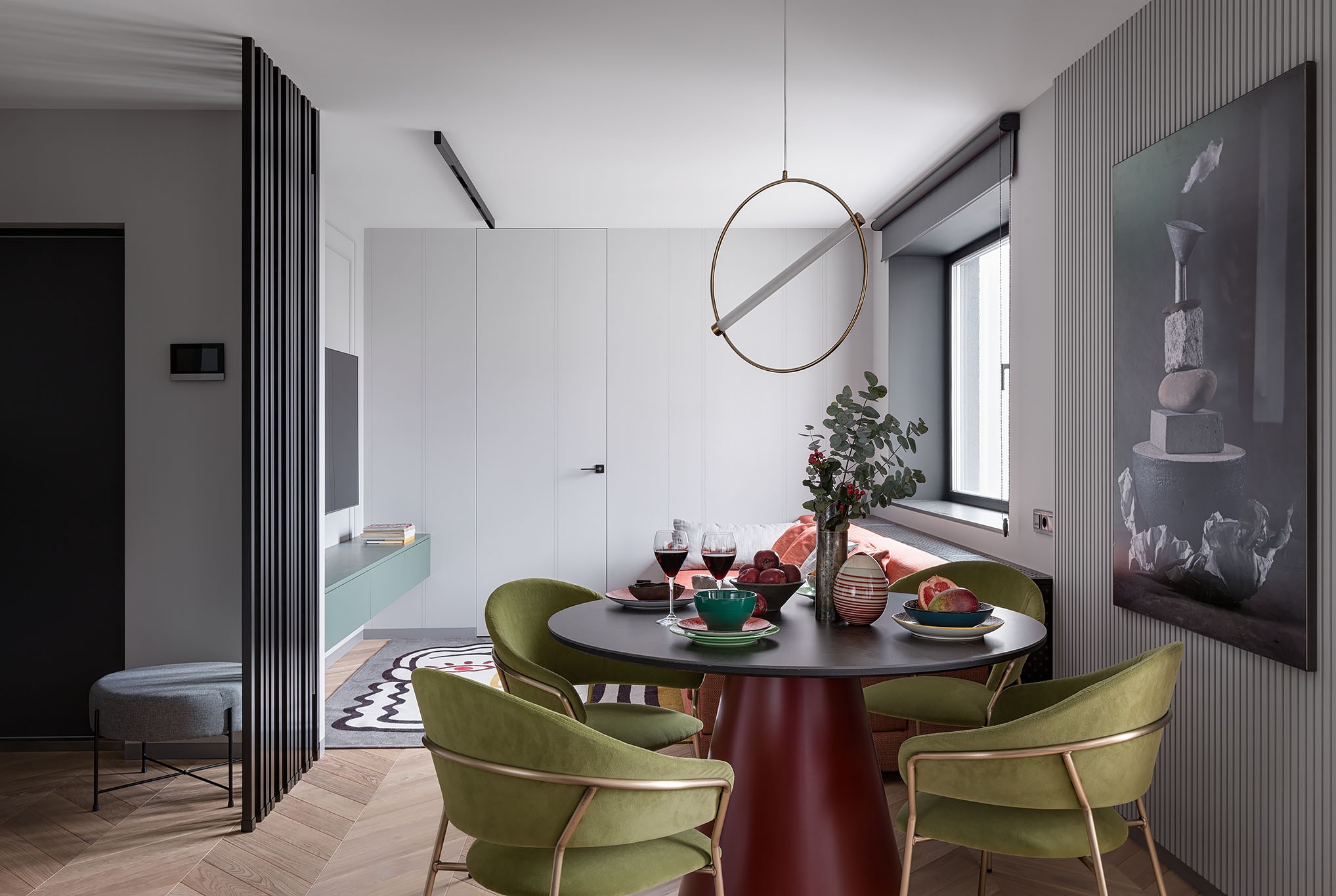
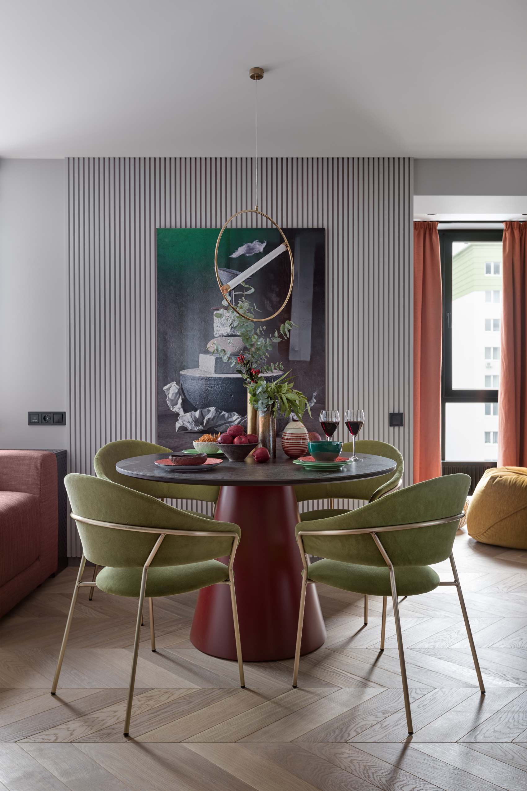
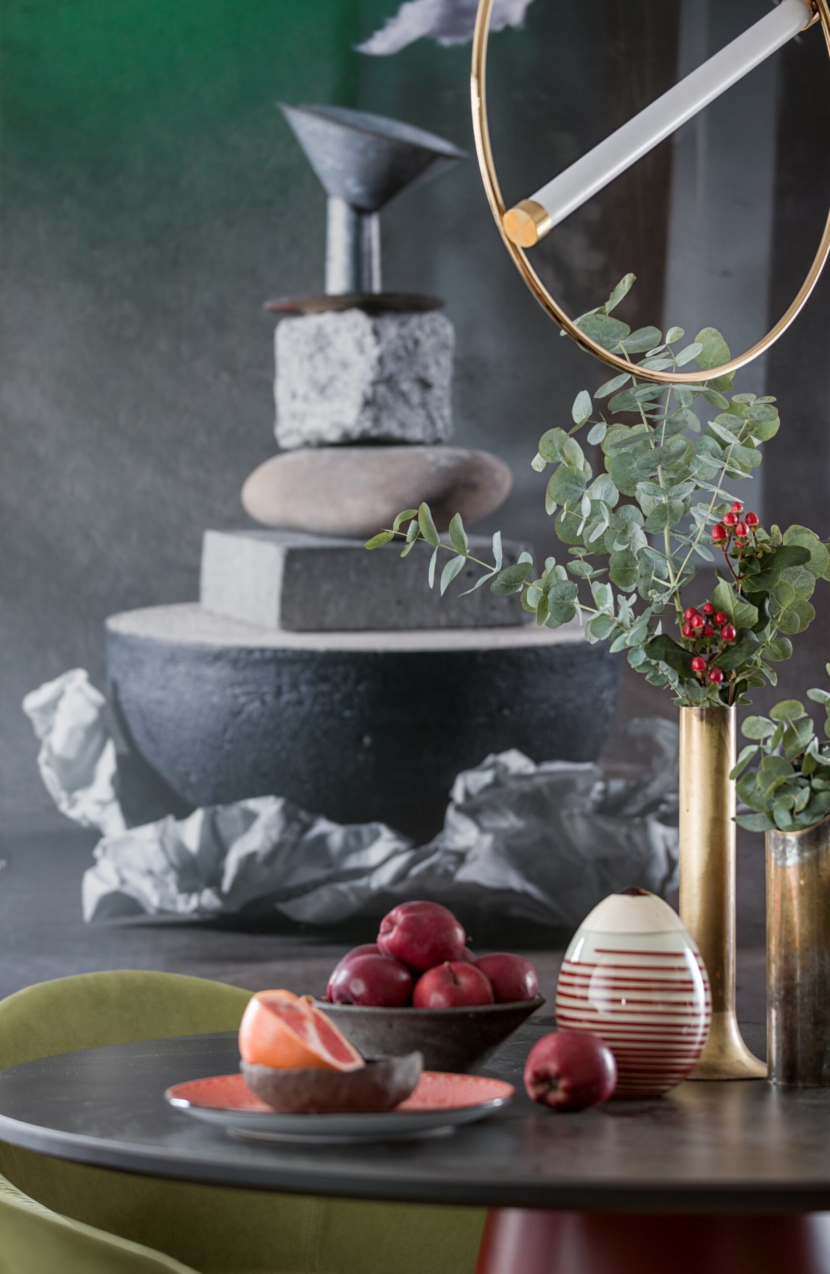
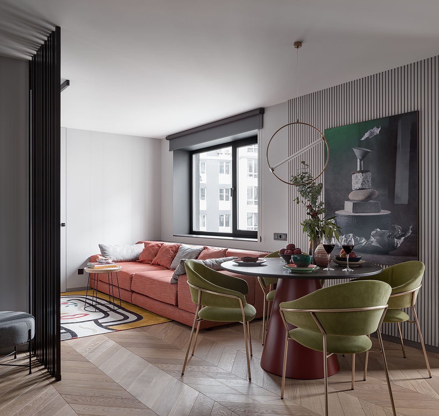
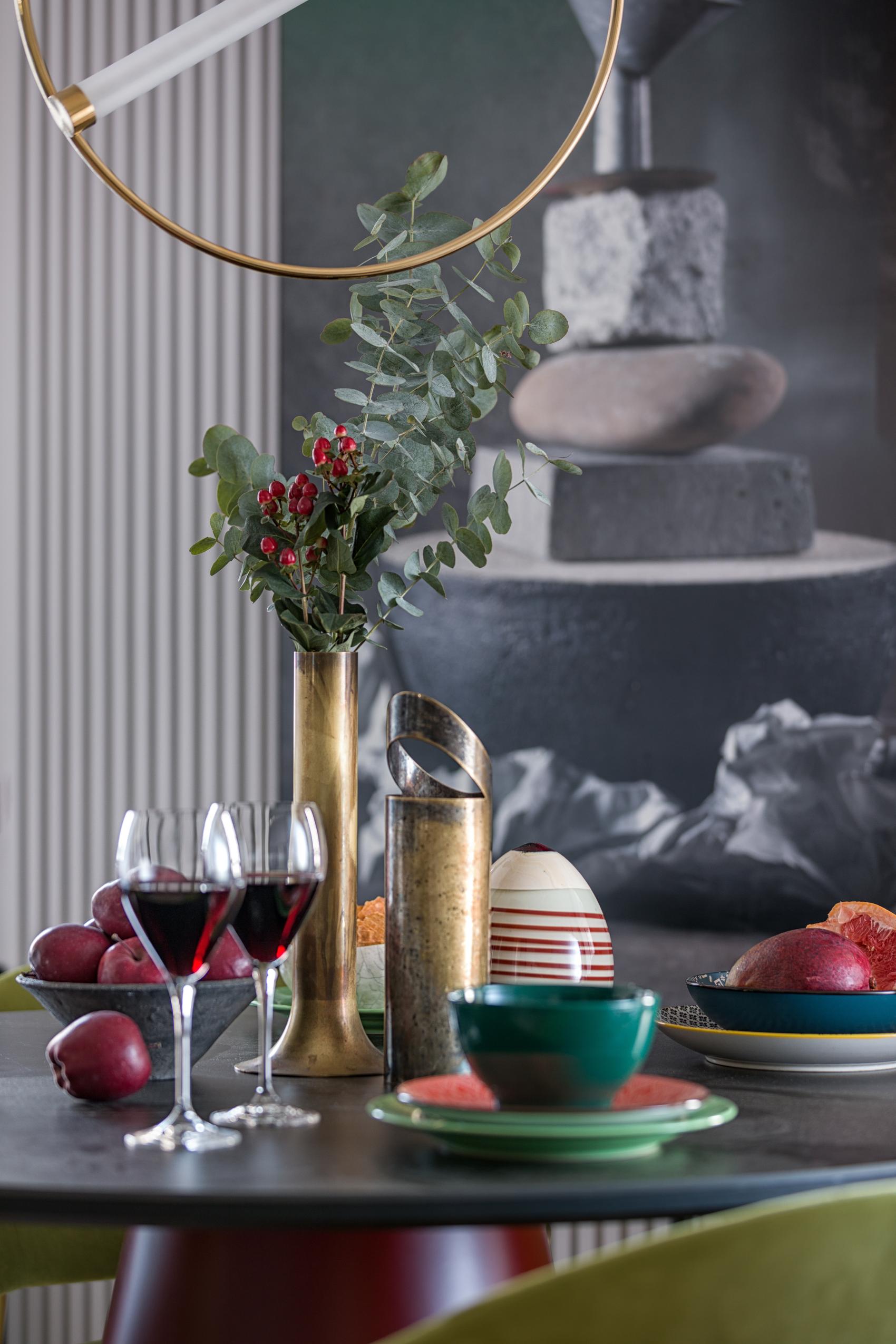
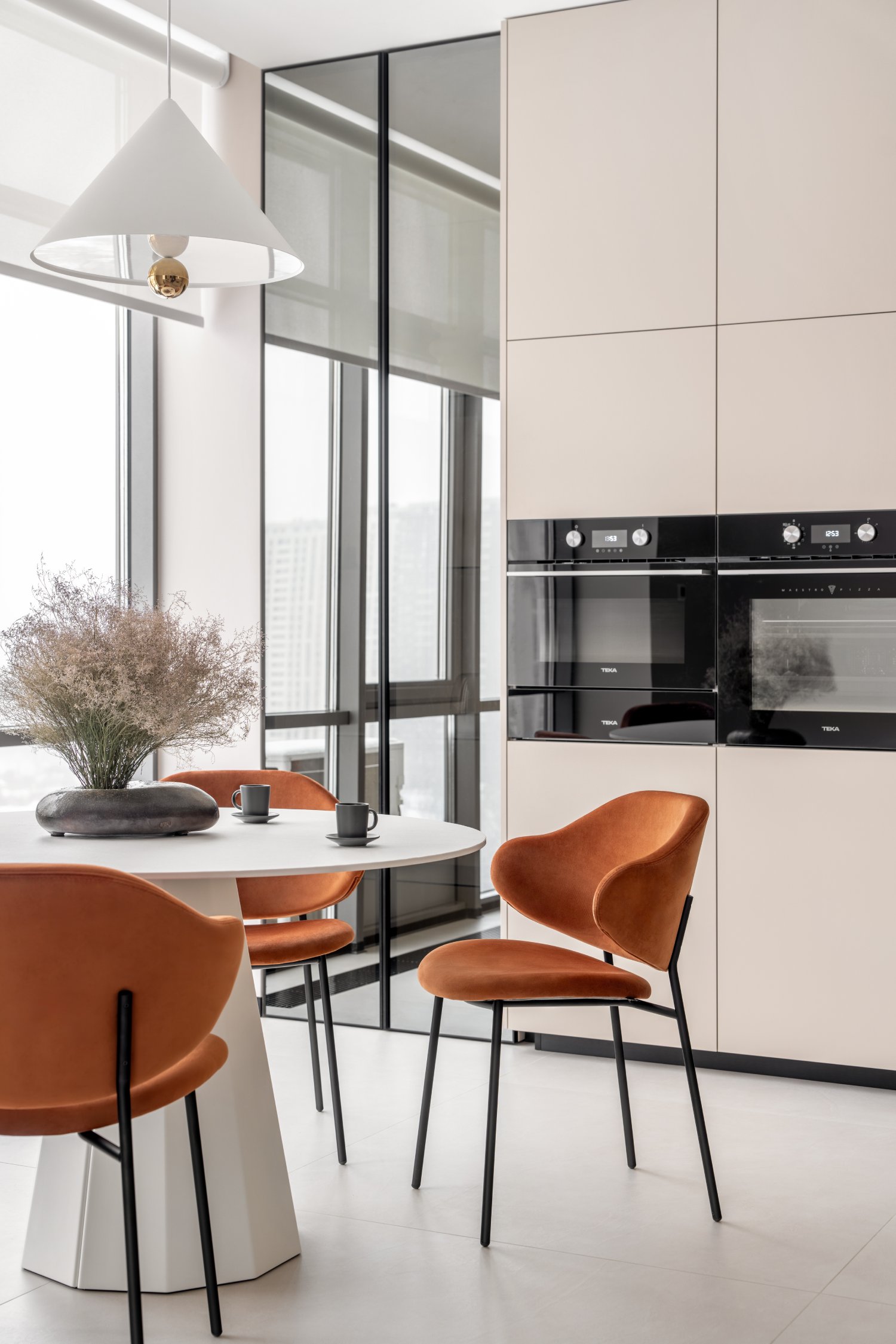
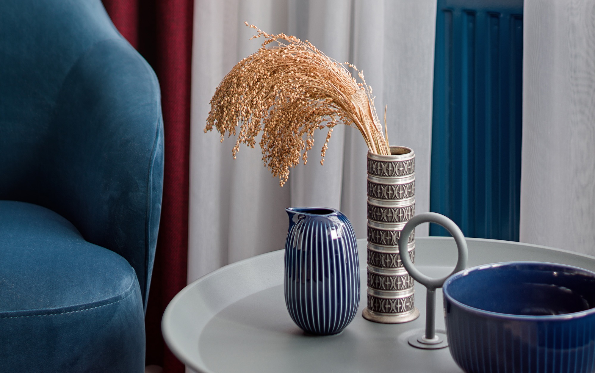
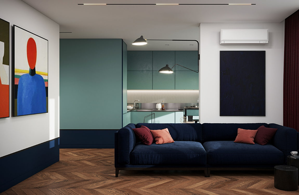
Although the interior features a neutral, nature-inspired color scheme, some decor and furniture elements serve as bright color accents. For example, Jazz chairs made by the Italian brand Pedralli in the dining area are not just green - it is a pleasant-looking, low-key grass green color.
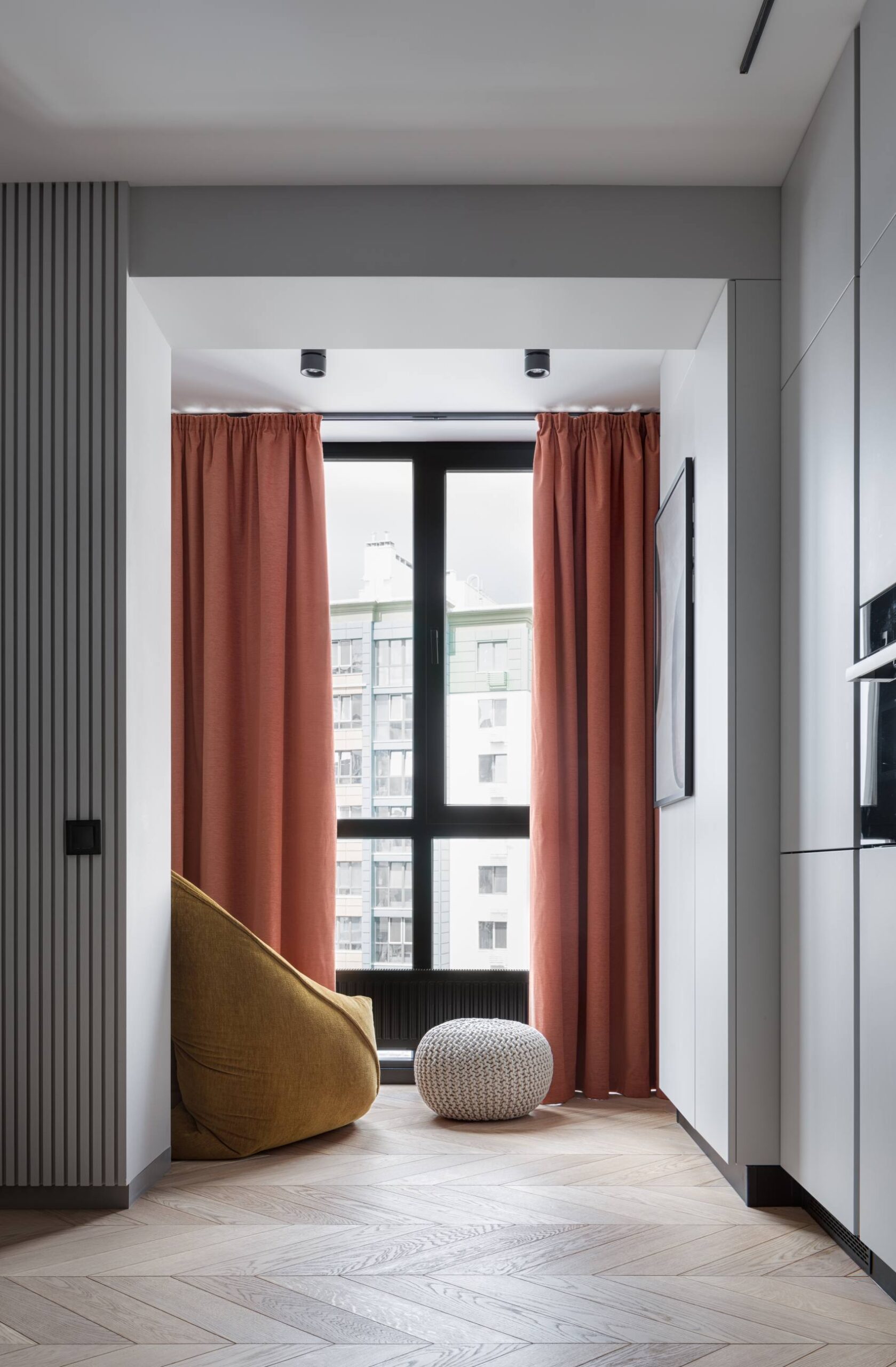
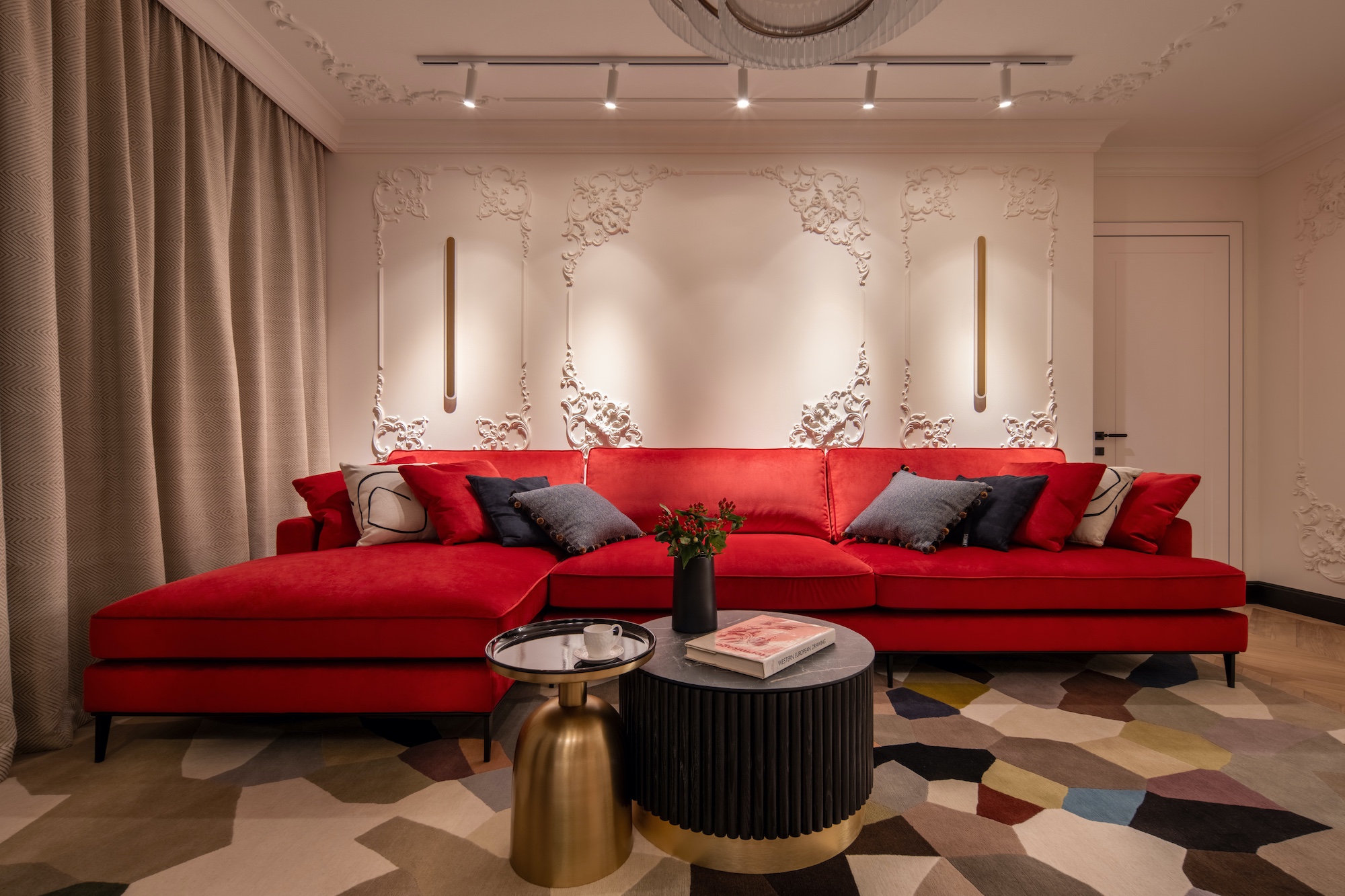
A peach-colored sofa pairs well with a table whose massive foundation is of rich terracotta shade. The color of the curtains combined with that of the sofa make the space feel cozy and homelike. It is a place where you would be happy to get together with your friends to enjoy music, a glass of wine and a good chat.
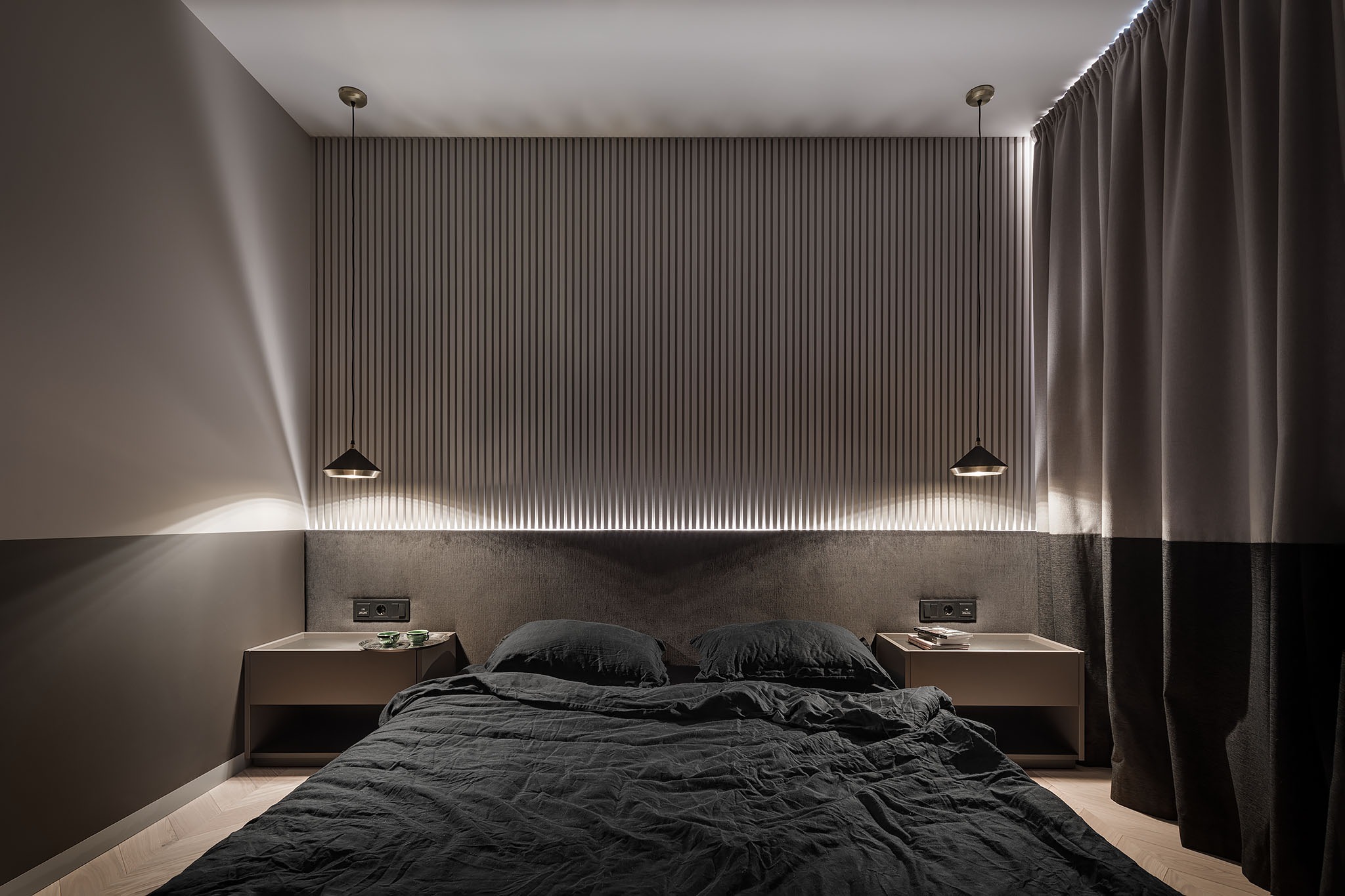
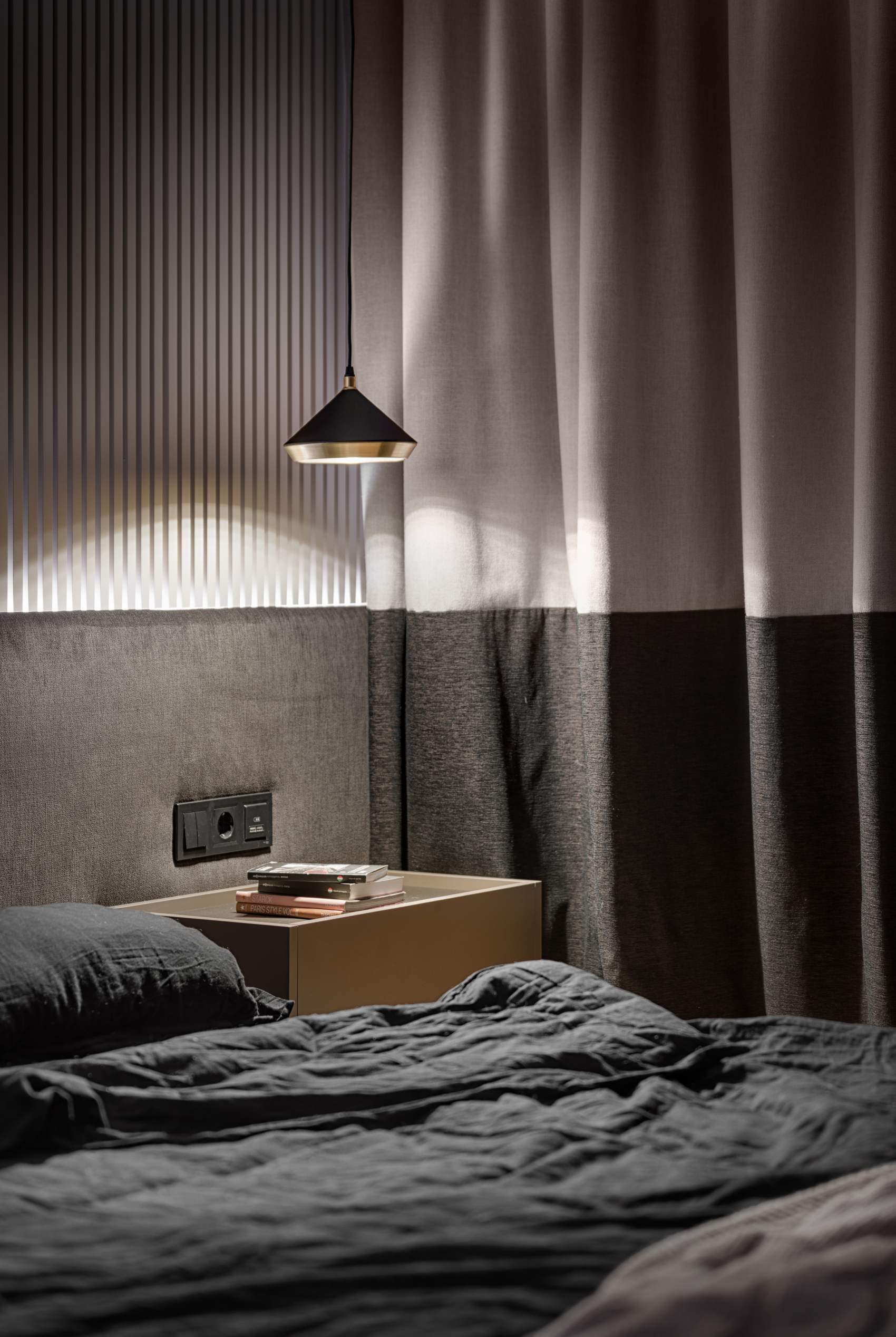
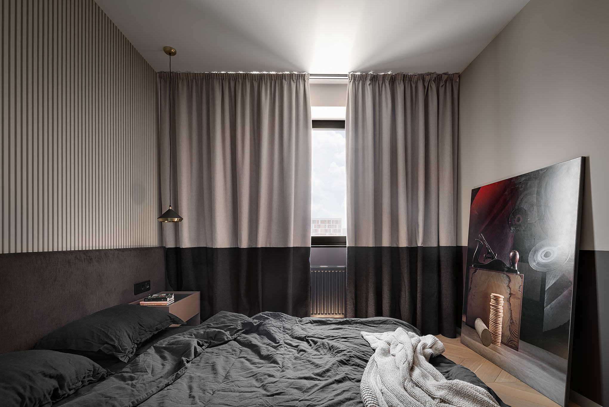
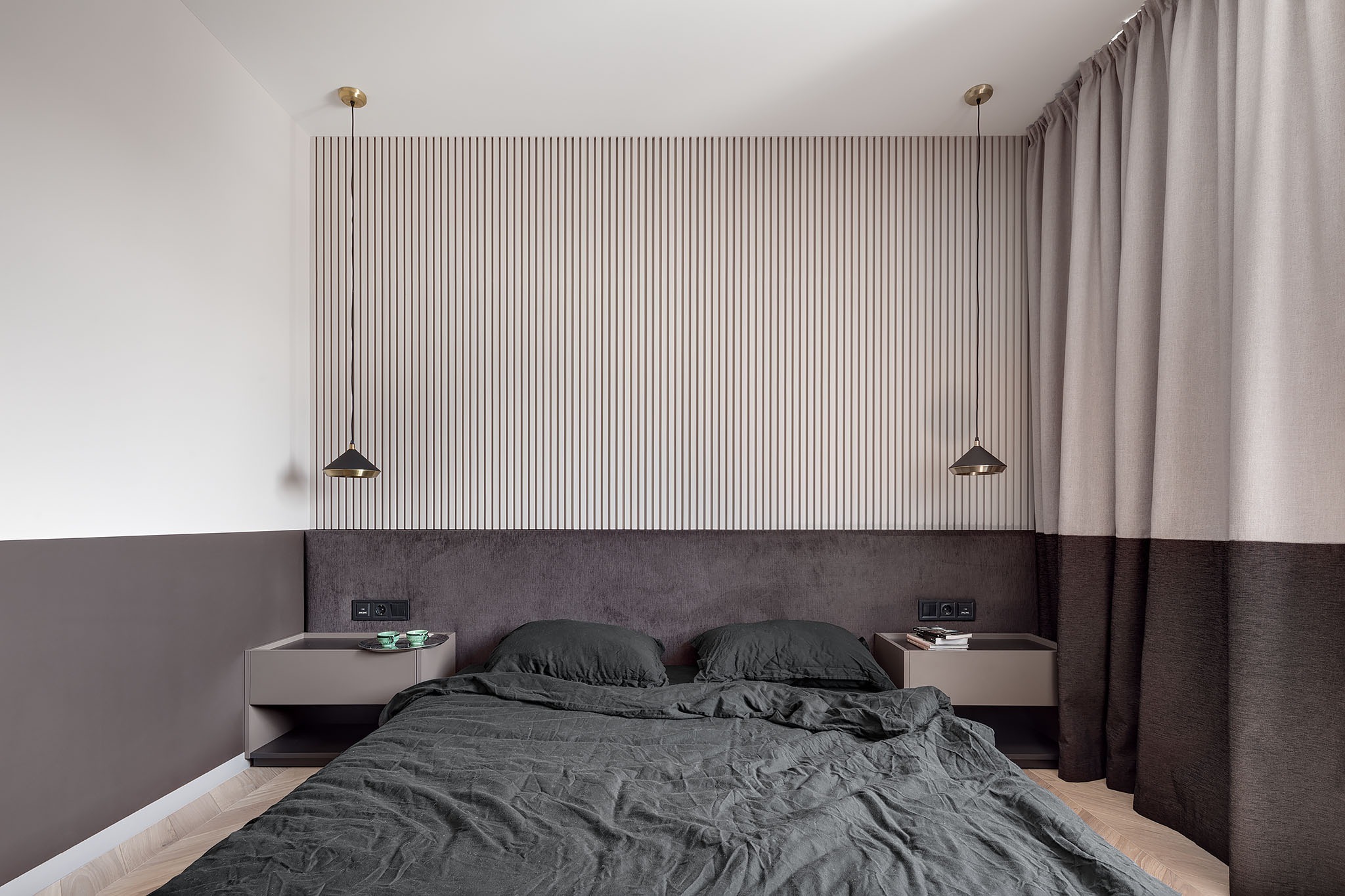
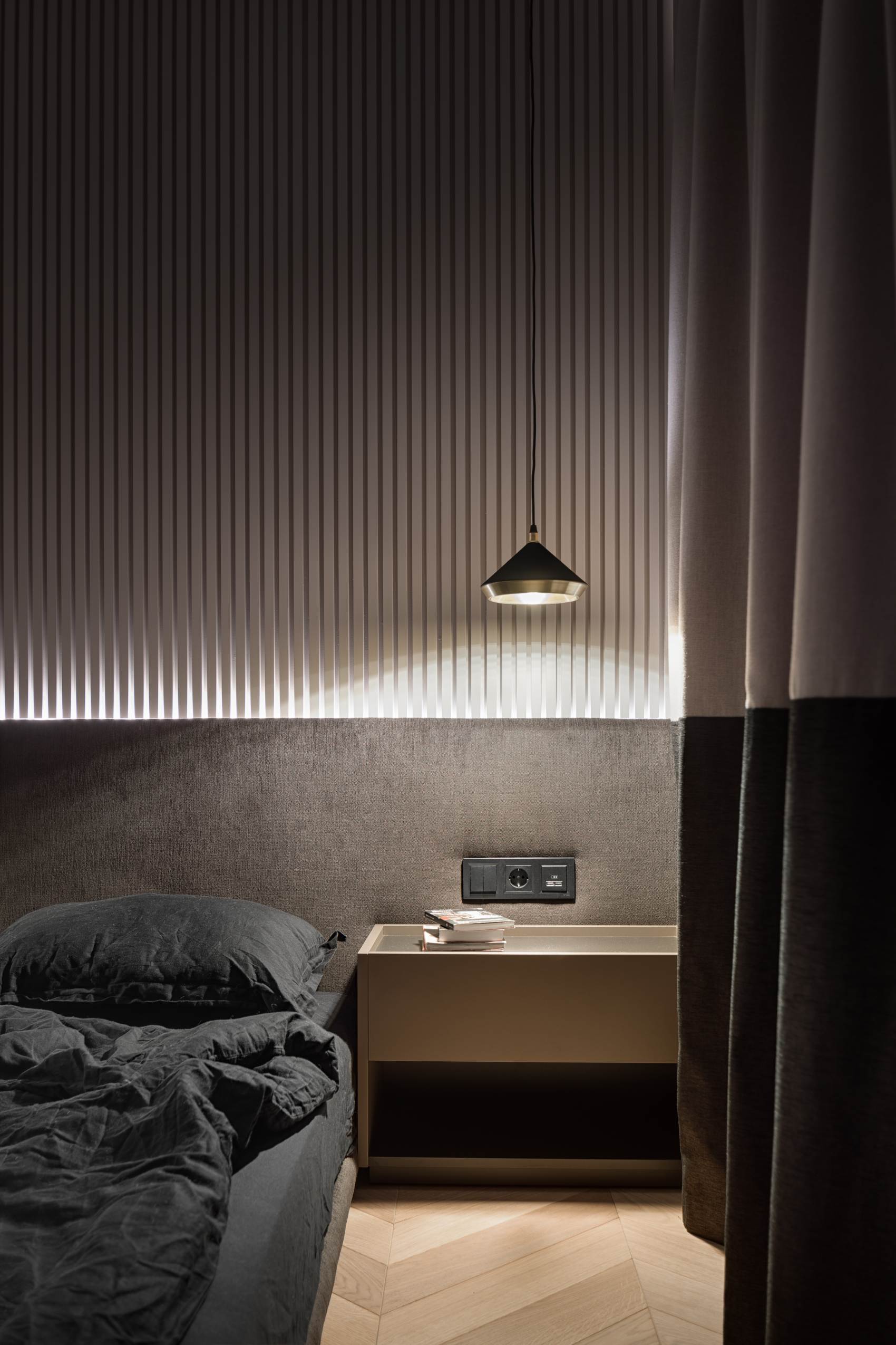
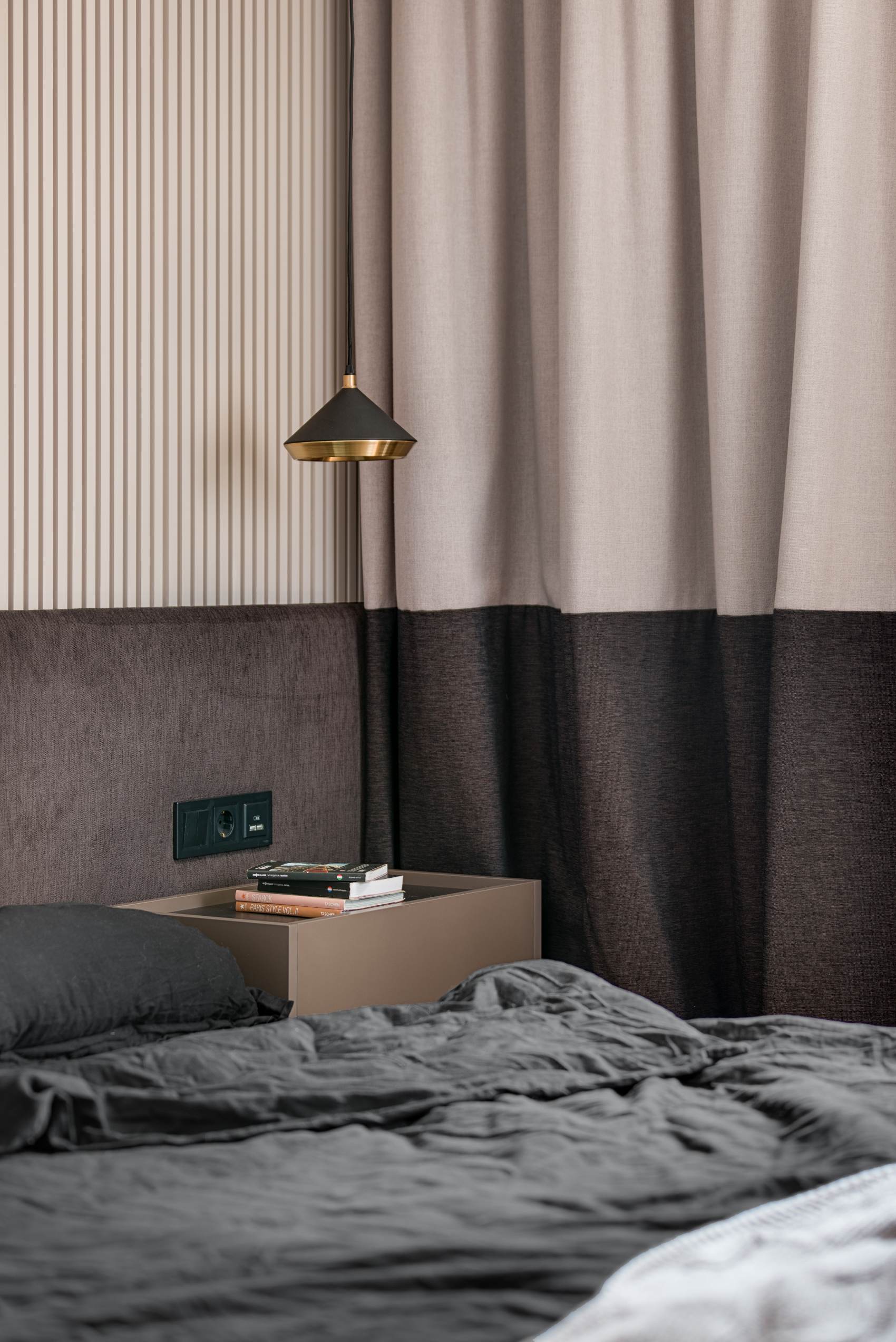
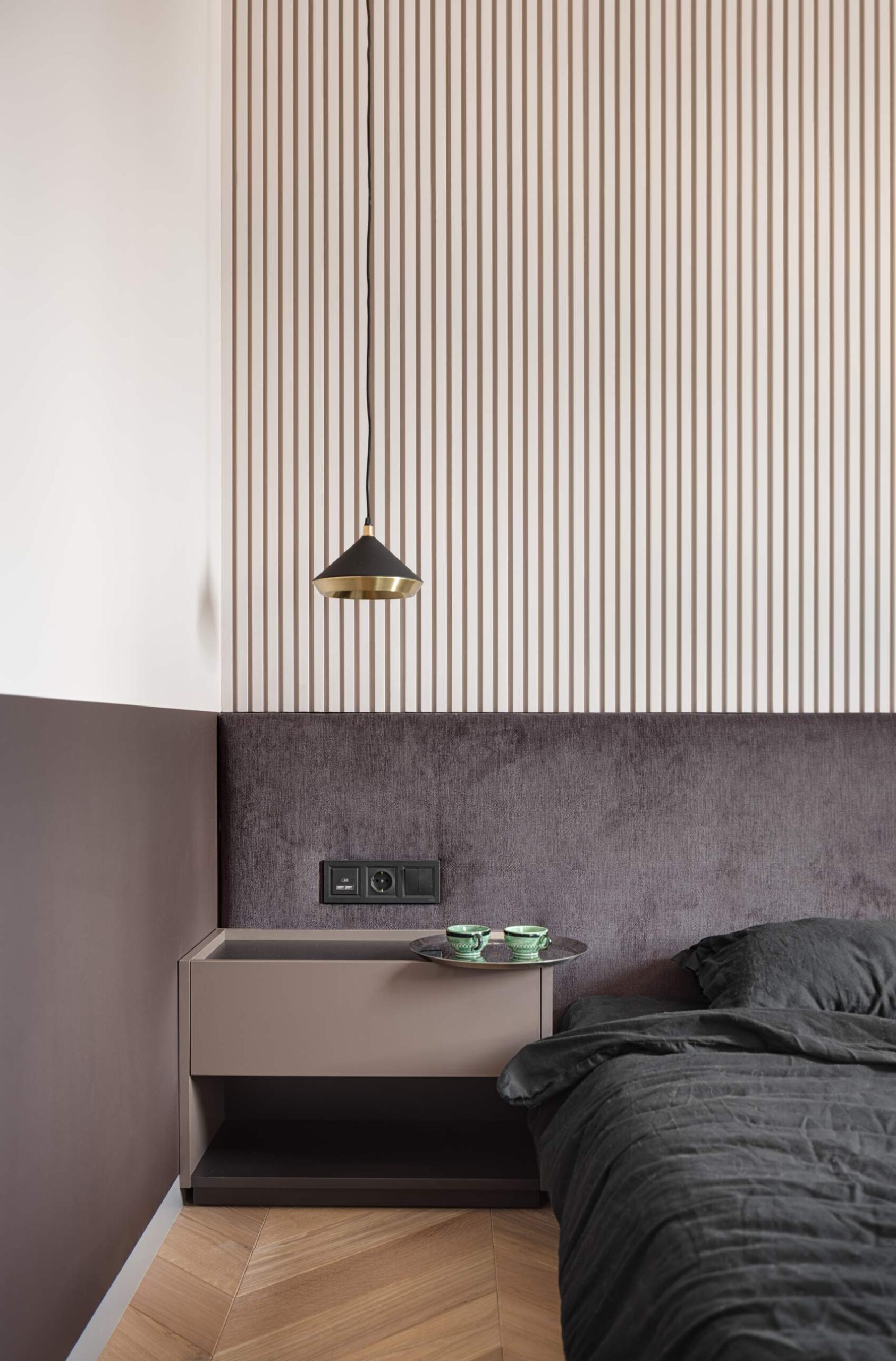
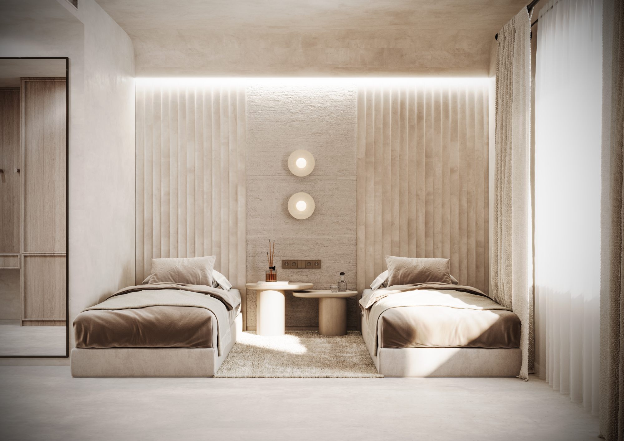
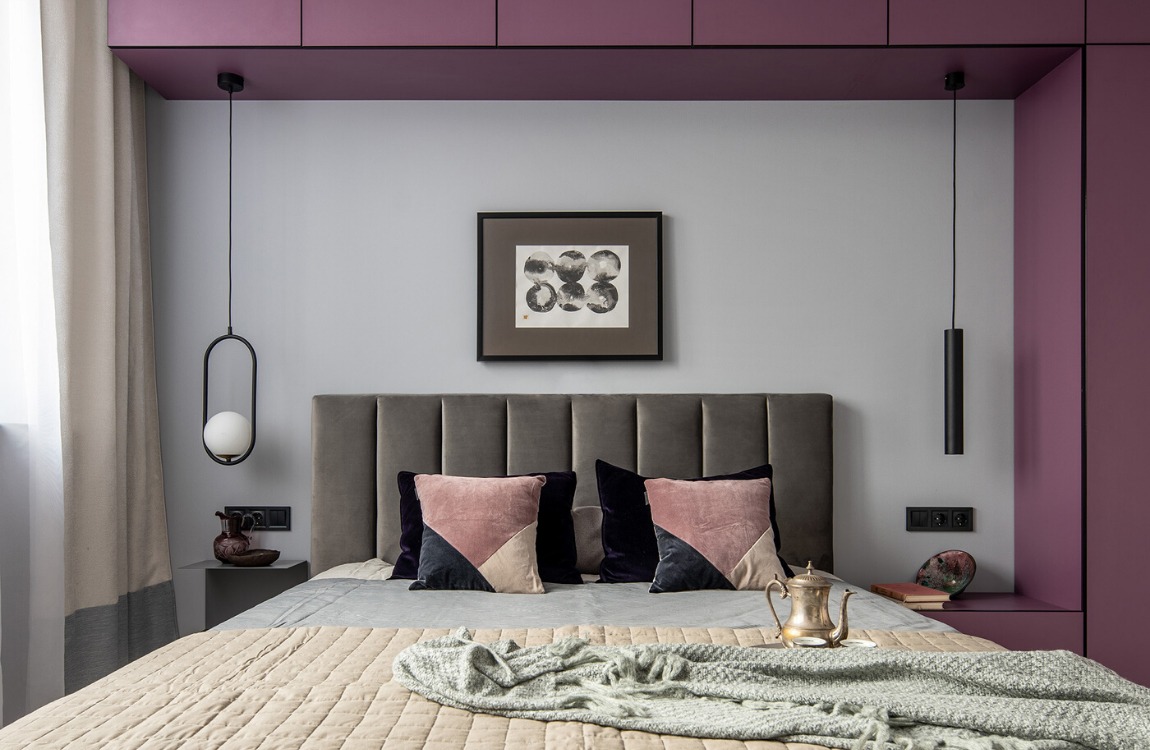
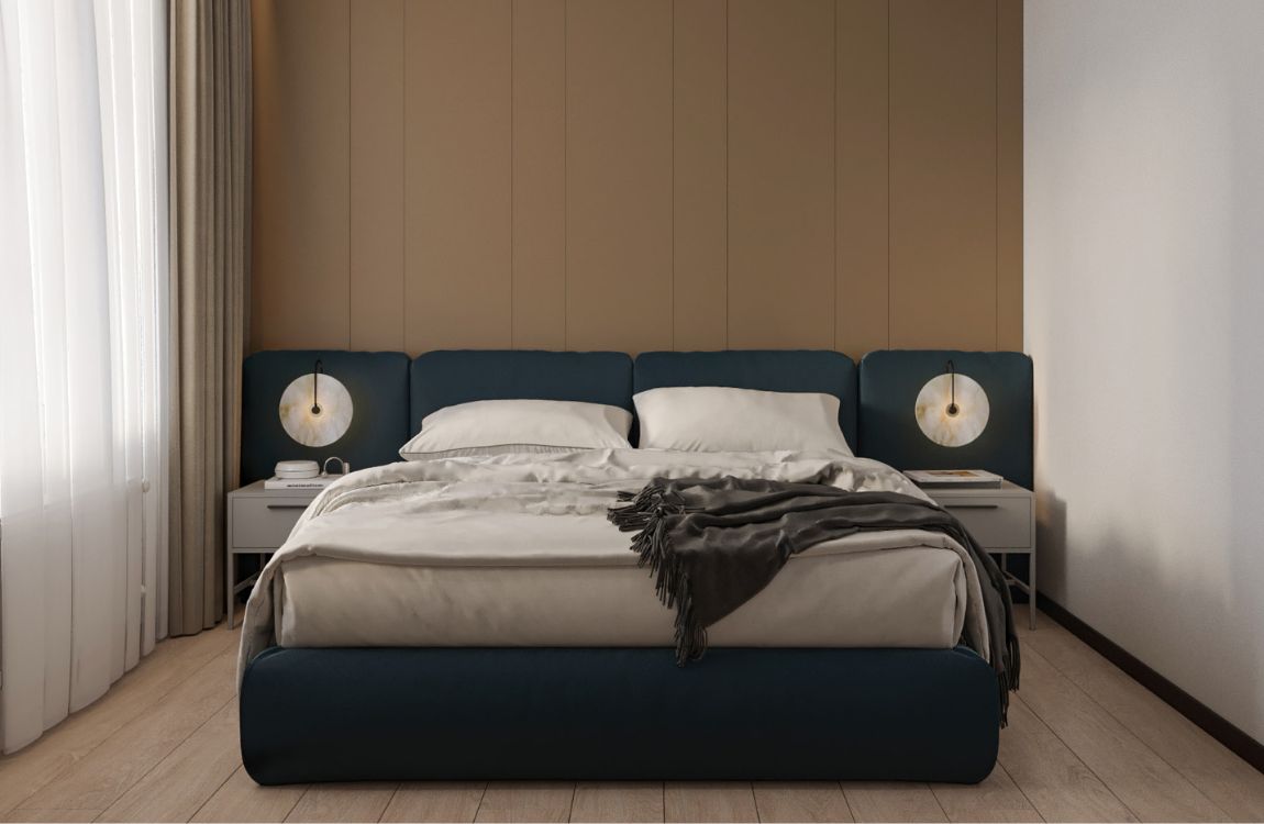
The interior of the bedroom is in keeping with the rest of the apartment, but it has a different atmosphere. Unlike the living room, the kitchen and the hall that have a rather buoyant look and feel, the bedroom is restrained and romantic. The line of the window sill is followed by that of the soft headboard and further continues into the two-tone curtains.
Soft mellow light fills the bedroom when you switch on a backlight installed in the plasterboard rail behind the bed. Brass lamps designed by the British brand Bert Frank add marvelously to the interior, which is based on geometric intersections of various shades of gray and charcoal black. Discreet backlight is also installed behind the curtains.
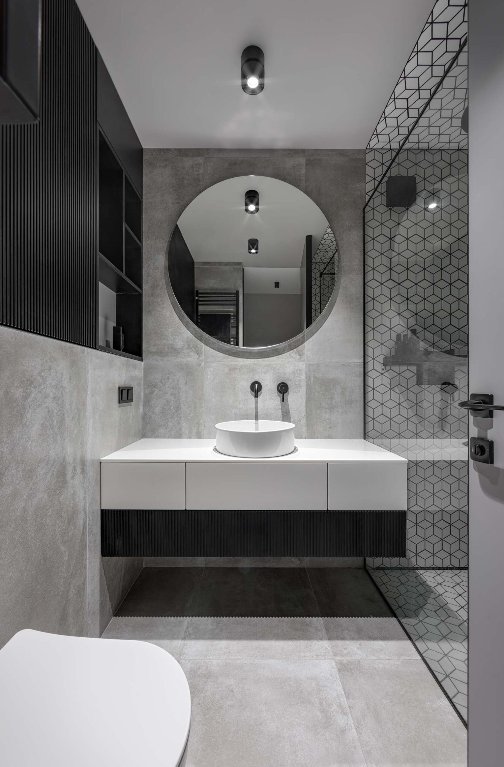
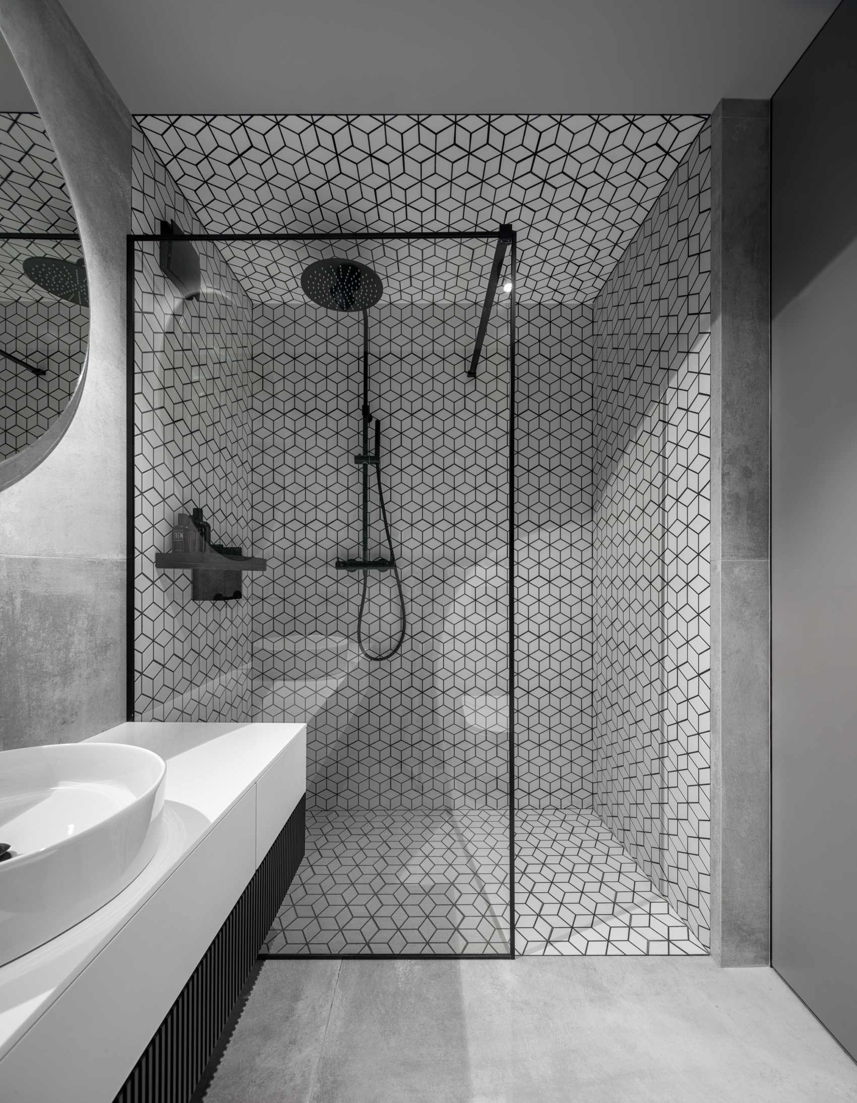
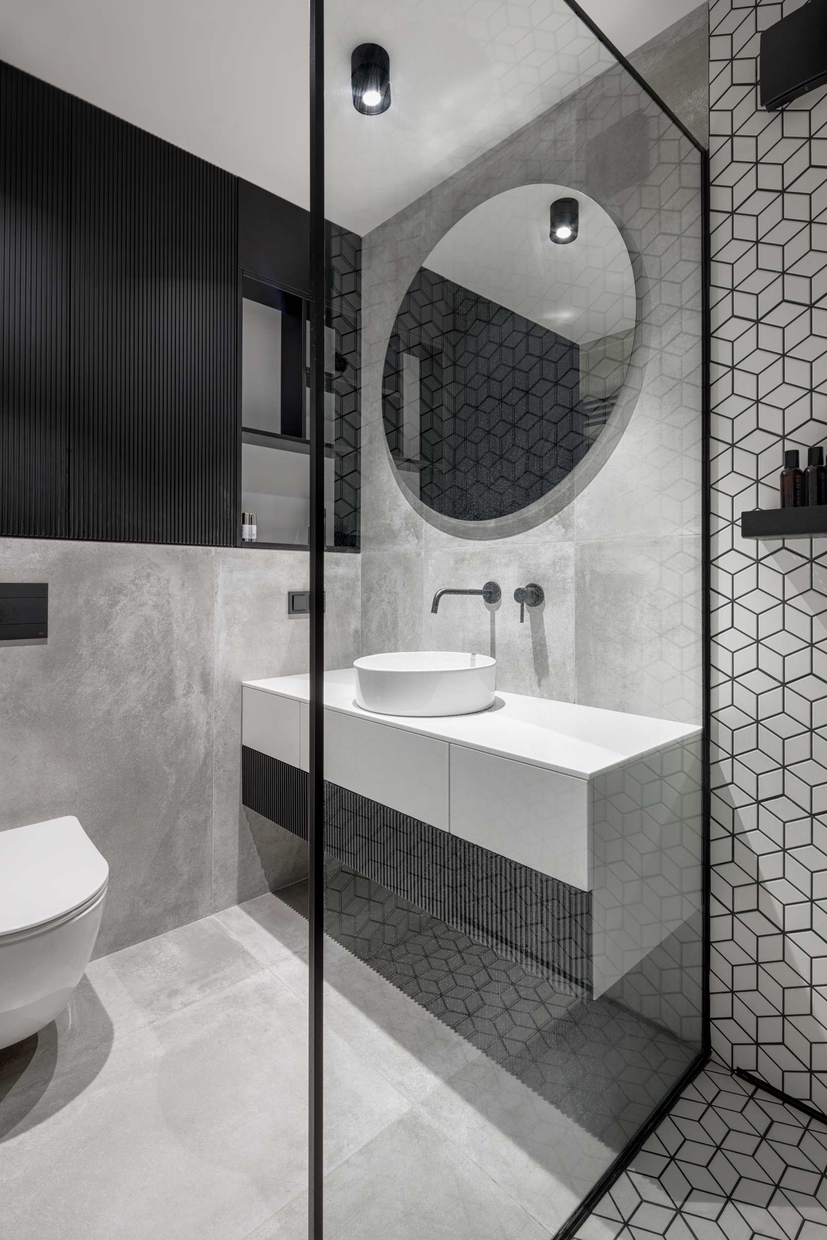
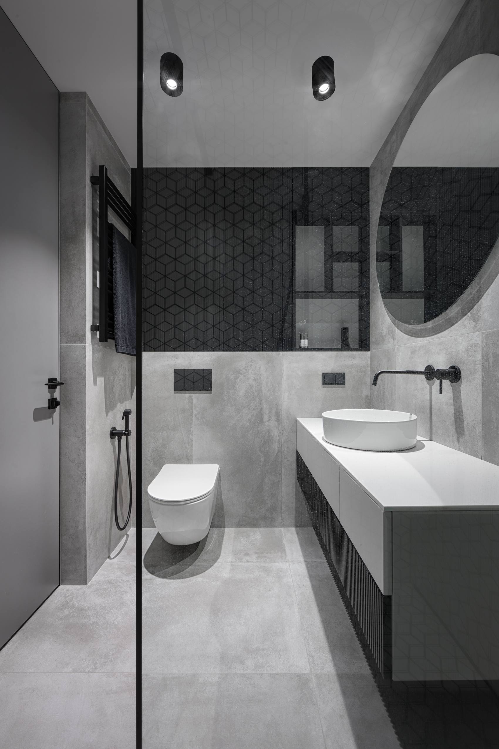
The bathroom in this apartment blew up in social media right after we shared our first visualizations. It received thousands of positive reactions and comments. If you compare those images with the photos of the completed bathroom, you won't see the difference. A delicate geometric ornament stretches from the walls to the ceiling. Apart from the skillful tile setter, we also invited an artist to decorate the ceiling in the bathroom - and he did it marvelously. The whole space shimmers with different shades of white, gray and black.
Starting from a rather trivial assignment, the interior turned out to be absolutely extraordinary – young and charismatic, just like the owner of this apartment.
Featured in:
1...Prima Interior Magazine
2...Platform Architecture
3...Archello
4...Interiorzine
5...Home Ideas Supply


 55 sqm
 completed (2021)
 Andrey Avdeenko